Site Settings is the main form for your site's template, colours, fonts, logo, shared announcement, search details (SEO) and journal articles. Markets you list on the Markets page and stockists you list on the Stockists page show on your site as soon as you save them, without publishing. A small, read-only Home preview sits beside the form. Your changes stay private until you publish. This guide follows Mara Quinn giving the Saltbush Ceramics site its warm clay look.
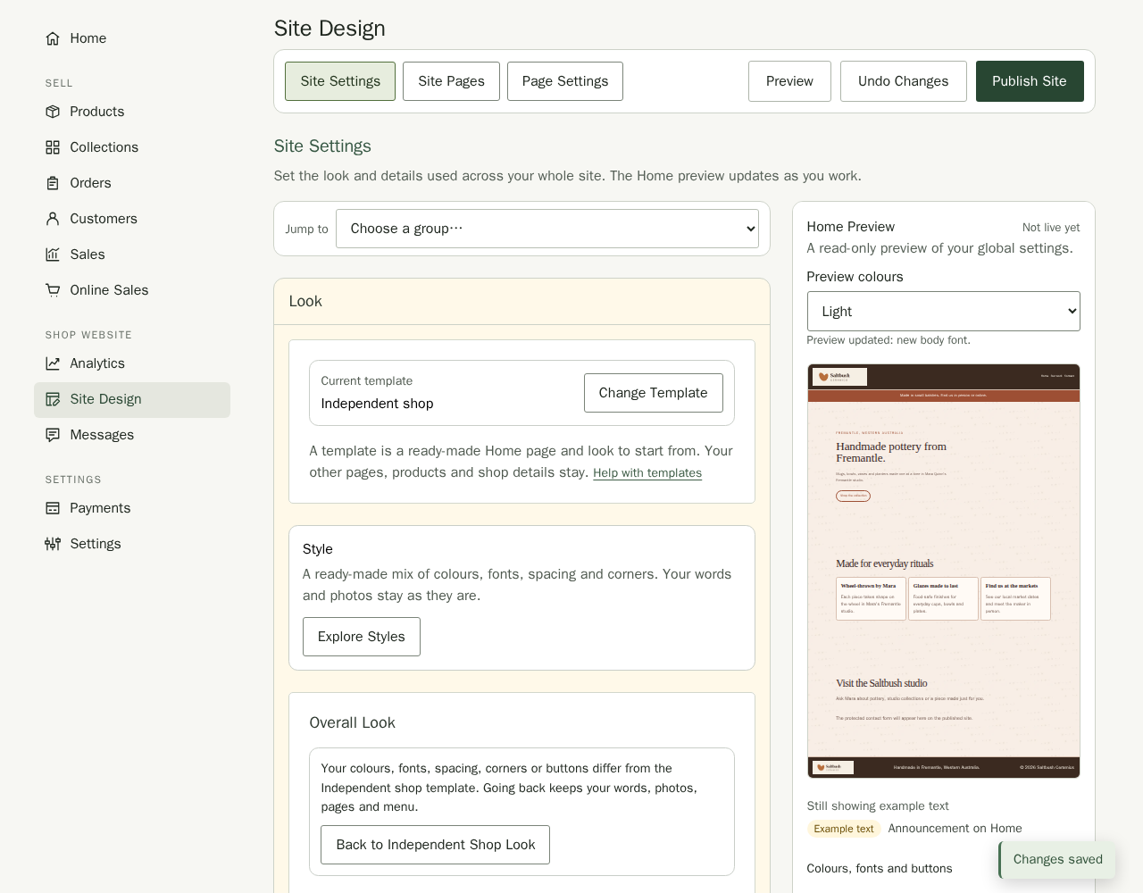
Open Site Design under Shop website, then choose Site Settings to change the site-wide choices in this guide. Stallee saves your changes by itself a moment after you stop editing, and the message Changes saved appears in the bottom corner to confirm it. To preview a complete About the shop, Visit us, Product care, Studio gallery or Custom work layout before choosing Create Page, duplicate a page to reuse its content, or manage page titles and menu links, use Site Pages. To edit page text and sections, choose Edit Page Content to open Page Settings.
The toolbar stays at the top as you scroll through Site Settings, Site Pages or Page Settings, including on your phone. Preview opens your saved draft in a new tab, only for people signed in to your shop; use the Page list there to look at other pages. Undo Changes puts your draft back to match your live site, and Publish Site shows your draft to customers. While Stallee saves, the corner message reads Saving…, then Changes saved, and it goes away after a few seconds. If a save does not work, the message explains why and stays until you choose Try Again or fix the problem. Under the previews, a small label says whether visitors see that version yet: Live, Not live yet or Not published yet. Undoing is explained near the end of this guide.
Set Up Your Site
A new shop shows Set Up Your Site at the top of Site Design until you publish for the first time. Its four steps take you from the template to a live site, and each ticks Done as soon as your draft meets it, before you save:
- Choose a Template opens the template gallery. Keep Independent shop or pick another look; the step ticks once you have chosen a template or replaced the words on Home.
- Replace the Words and Photos on Home opens Home in Page Settings. The step ticks when no section on Home still holds the template's example text.
- Add a Page and a Menu Link opens Site Pages. The step ticks when a page you added has a link in your menu.
- Publish Your Site opens the publish confirmation. If you are not an owner or admin, the step tells you who publishes.
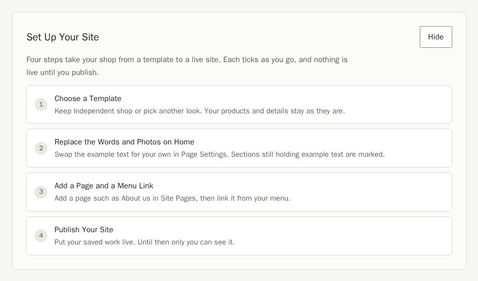
Choose Hide to put the checklist away; it stays hidden on every device until you choose Show Site Setup beside the view heading. Your Contact section starts with the email address you signed in with, so enquiries reach you from the first day. Changing templates keeps an email address you typed.
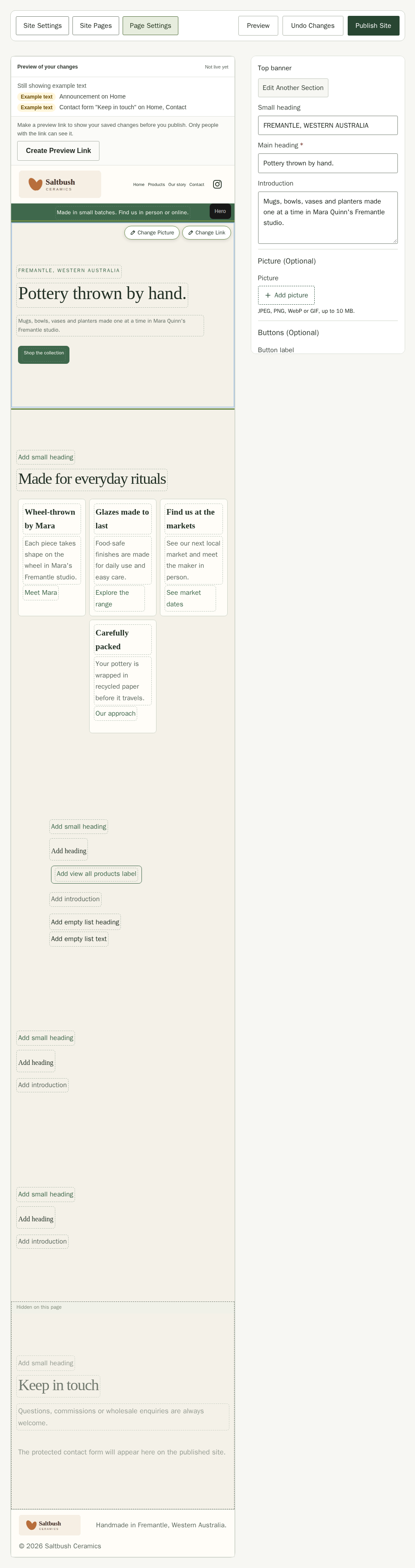
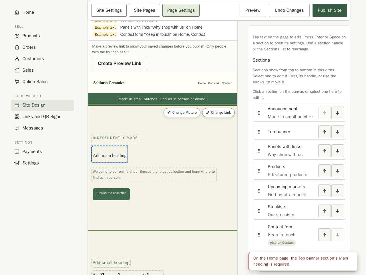
Sections that still show the template's example text are marked Example text under the Home preview in Site Settings and under the preview in Page Settings, with the section and page named so you can find them. Example text is fine to publish if you want to, but a contact email address on example.com is not: Stallee refuses to publish until you enter your own in the Contact section.
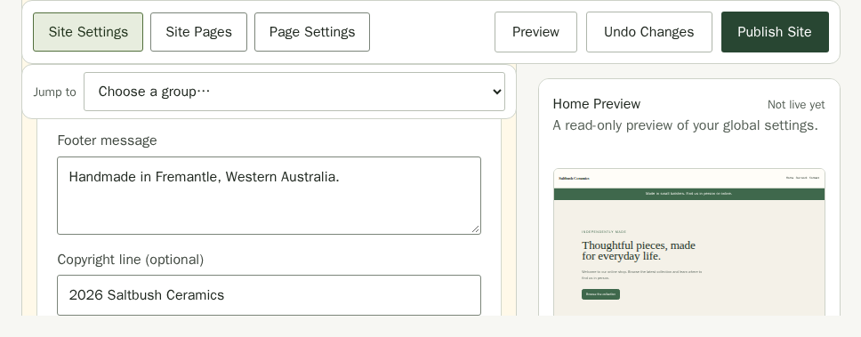
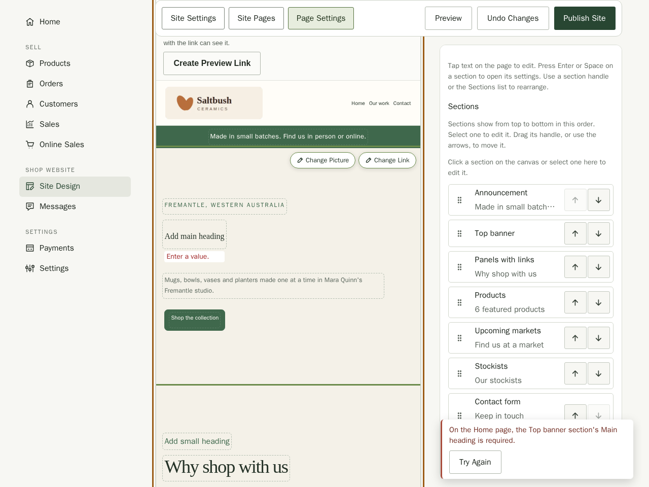
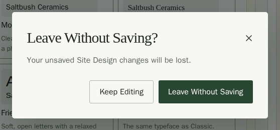
If something needs fixing before Stallee can save, the corner message stays on screen with Try Again. It names the page and section, such as On the Home page, the Top banner section's Main heading is required. Open that page in Page Settings and correct the field. A Site Settings field with a problem is named in the same message, such as Maximum logo width: Value must be less than or equal to 480. Correct the value, then choose Try Again. If you try to leave Site Design before a change has saved, Stallee asks first: choose Keep Editing to stay, or Leave Without Saving to discard them. Moving between Site Settings, Site Pages and Page Settings keeps your changes and does not ask.
Find a Setting
Site Settings sorts its choices into five groups. Each group is a heading you open and close; Look starts open.
- Look: the template, styles, colour palette, fonts, buttons, your own fonts, and the header, footer and page background.
- Logo and Shop Details: your logo, browser icon, share image, footer message, social links and online sales.
- Search Engines and Analytics: what search results show, your public business details, built-in analytics and an optional analytics service.
- Announcement and Journal: the shared announcement, your journal's name and articles, and where markets and stockists are managed.
- Advanced: Advanced CSS, for web developers.
- Choose a group under Jump to at the top of the form. The list stays pinned below the toolbar as you scroll. Where the groups do not fit on one line, such as on a phone, it is a single list: choose a group from it.
- Stallee opens that group and brings its heading to the top, ready for you to work through its settings.
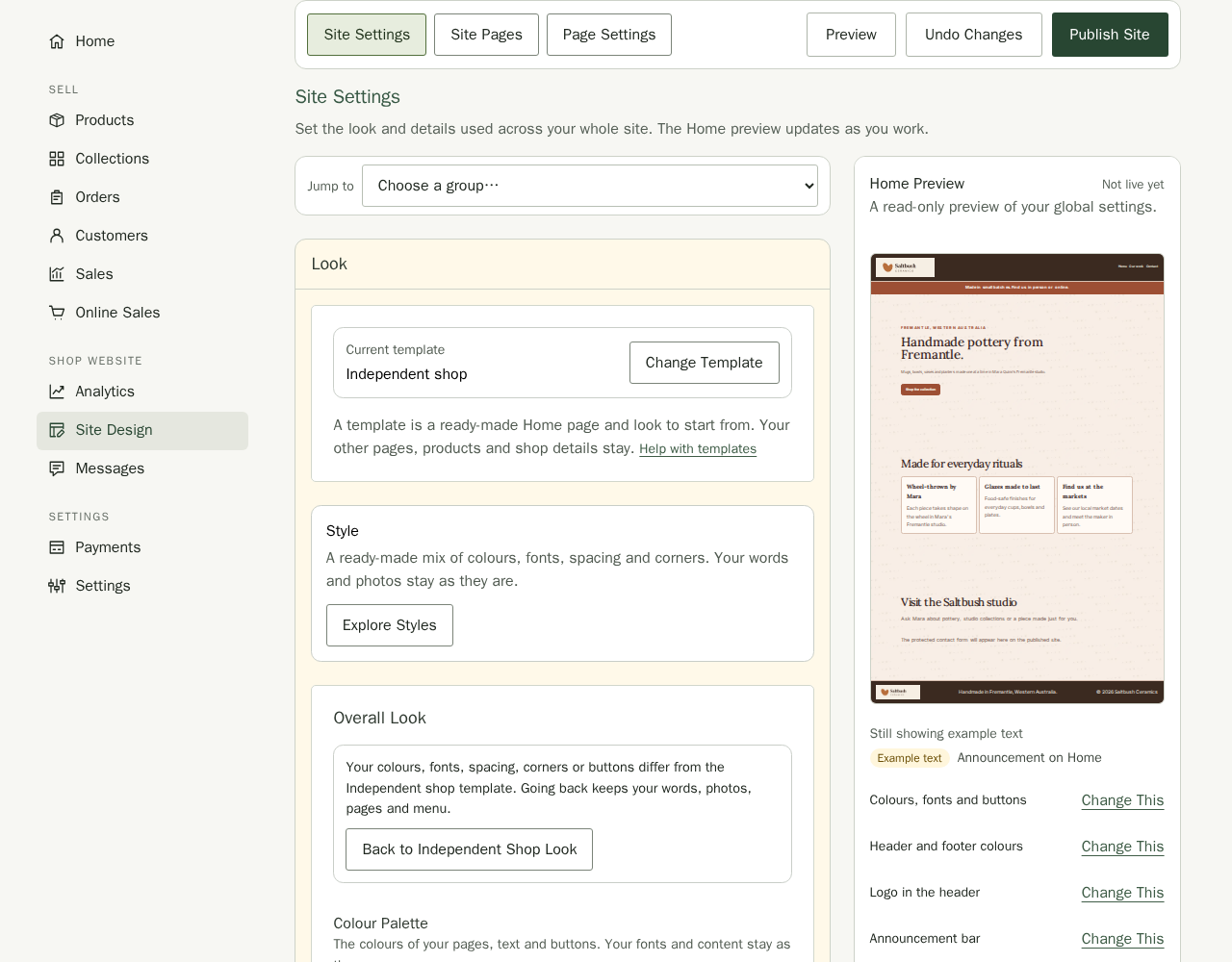
Beside the Home preview, Change This opens the group that changes each part of the page: colours, fonts and buttons; header and footer colours; the logo in the header; the announcement bar; and the footer message and links. The preview itself is read-only; edit page content in Page Settings. After you change the palette, a font or a colour, a line above the preview says what it now shows.
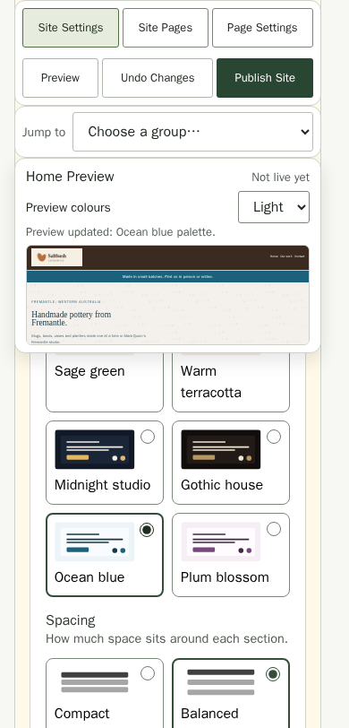
On a phone, the Home preview is a short strip above the form. While the Look settings are on screen it stays pinned under Jump to, so you see a new palette, font or colour without scrolling back up.
Choosing Site Settings, Site Pages or Page Settings takes you to the top of that view. Help with Site Pages and Help with Page Settings open the Site Pages guide. Small Help with links beside templates, the header, footer and background, Advanced CSS, the menu and Section Appearance open the part of a guide that explains them. Page Settings names the open page in its heading, with a Page selector beside it, and has the canvas, the Sections list and Section Settings.
Choose a Template
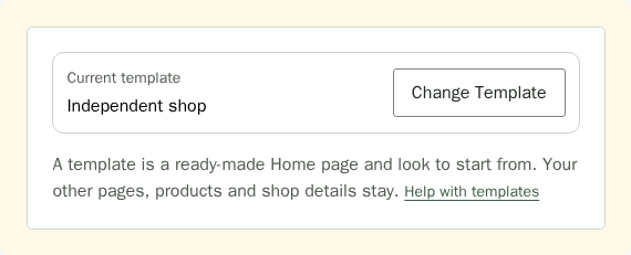
A template is a ready-made Home page and look to start from. Pick the one that suits your shop; you can change anything about it afterwards. Your other pages, products and shop details stay.
- In Site Design, choose Site Settings. Choose Change Template beside your current template.
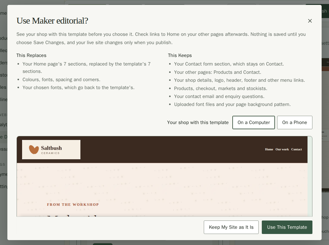
- Choose a template card. Each card sketches the template with your shop's name and its products, and says who it is best for. There are ten: Independent shop, Market stall (your upcoming markets first), Food producer (your range, markets and answers about ordering and allergens), Maker gallery (your work in pictures first), Story led, Maker editorial, Minimal shop, Bold catalogue, Studio portfolio and Local services. The card marked Current Template is the one you are using now.
- Read This Replaces and This Keeps, then look at the preview, which shows your own products (or No products yet). Choose On a Computer or On a Phone to compare sizes.
- Choose Use This Template, or Keep My Site as It Is if you change your mind.
- The corner message says the template is applied. Choose Undo there to put your site back exactly as it was, including your colours, Home sections, Advanced CSS and menu links. Undo is there until your next change.
- Stallee saves the template as part of your draft. Your live site changes only when you publish.

Your current template stays visible in Current Template. Choose Change Template whenever you want to browse the templates again.
Choosing a template replaces your Home page sections, colours, fonts, spacing, corners and Advanced CSS with the template's. Menu links to Home sections move to the template's matching section, or are removed when it has none; the confirmation names them. Your products, checkout, other pages, markets, stockists (shops that sell your work), logo, page background pattern and uploaded font files stay as they are. If you already have a design you like, leave the template alone and change the details below instead.
Try a Style Without Replacing Your Content
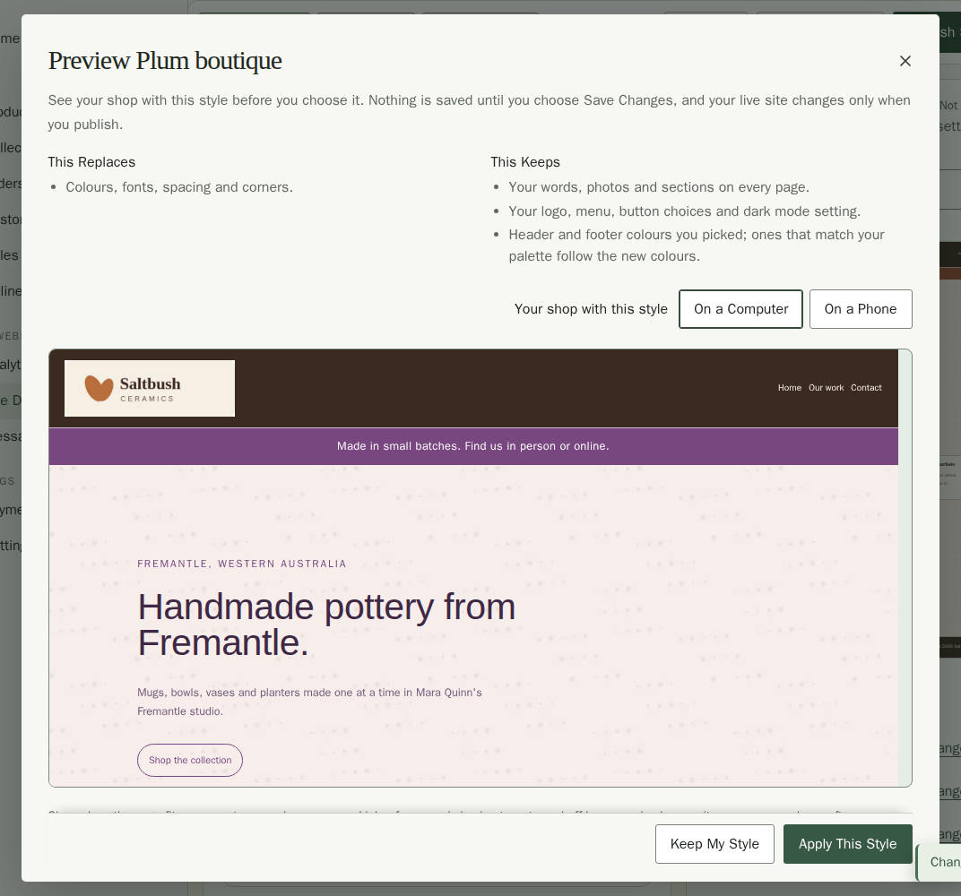
In Site Settings, open Explore Styles. Choose Quiet minimal, Warm handmade, Bold studio, Classic editorial, Coastal calm or Plum boutiqueto preview your current site with a different look. Each card says what the style sets, such as Friendly headings with Modern body text, and Warm handmade is marked Recommended for Most Shops. Coastal calm pairs ocean colours with classic headings and airy spacing; Plum boutique pairs plum colours with friendly headings and rounded corners. The preview lists what the style replaces and keeps and shows your own products. Choose On a Computer or On a Phone to compare sizes. Choose Keep My Style to cancel, or Apply This Style to use the colours, fonts, spacing and corners.
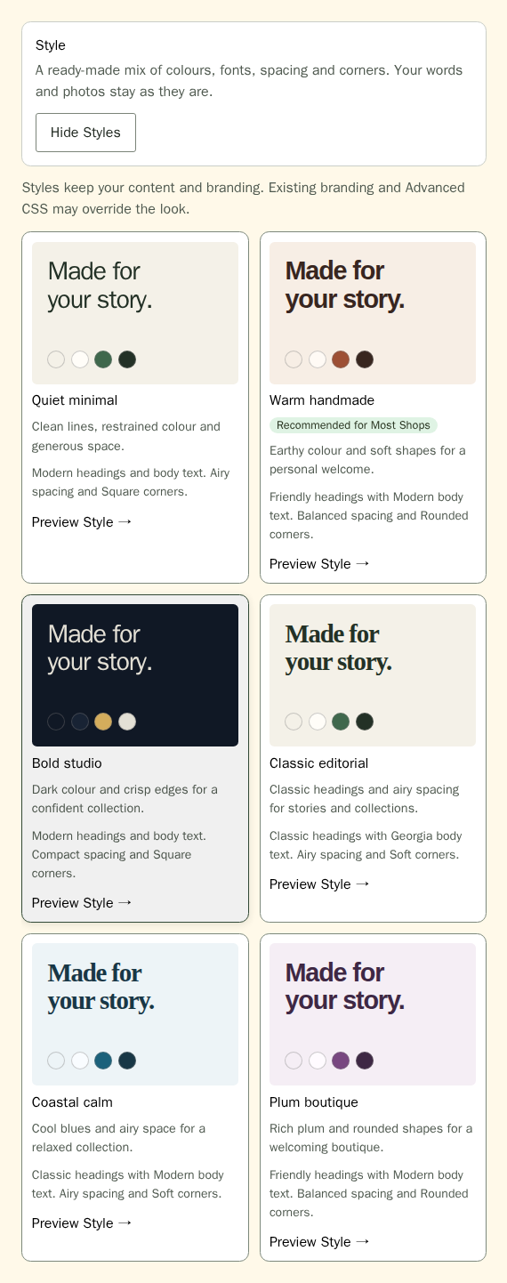
A style keeps your text, sections, photos, uploaded files, branding, button choices, section appearance, Advanced CSS and Dark mode setting. A font you chose yourself goes back to the style's fonts. Your existing background images may affect text contrast, so check the preview before applying. Applying it does not publish: choose Undo in the corner message to go back to your previous look until your next change, or choose Publish Site when you are ready.
Add a Ready-Made Section Layout
- Open Page Settings and choose your page.
- Open Sections, then Choose a Section Layout.
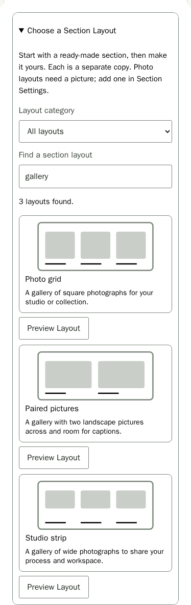
- Choose a Layout category: Stories and pictures, Products and search, or Questions and signup. Enter a name in Find a section layout to search within that category. The search also matches each layout's description. Clear the search and choose All layouts to see all 19 choices again.
- Choose Story with image, Three feature panels, Welcome banner, Product spotlight, Portrait story, Wide photo, Centered welcome, Reading room, Statement banner or Compact feature links. For a set of pictures, choose Photo grid, Paired pictures or Studio strip. For questions and answers, choose Common questions, Buying guide or Care guide. To help customers browse or sign up, choose Find a product, Product showcase or Newsletter invitation.
- The layout goes straight after the section you have selected, or at the end of the page when none is selected. A note above the canvas confirms it. Edit the new section in Section Settings.
- Choose Publish Site when ready.
The section is added at the end of your current page. Each copy is independent: editing one does not change another. Adding a layout keeps your existing content and clears both picker filters. Your changes stay private until you publish. Your site's section limits still apply.
Preview a Section Layout
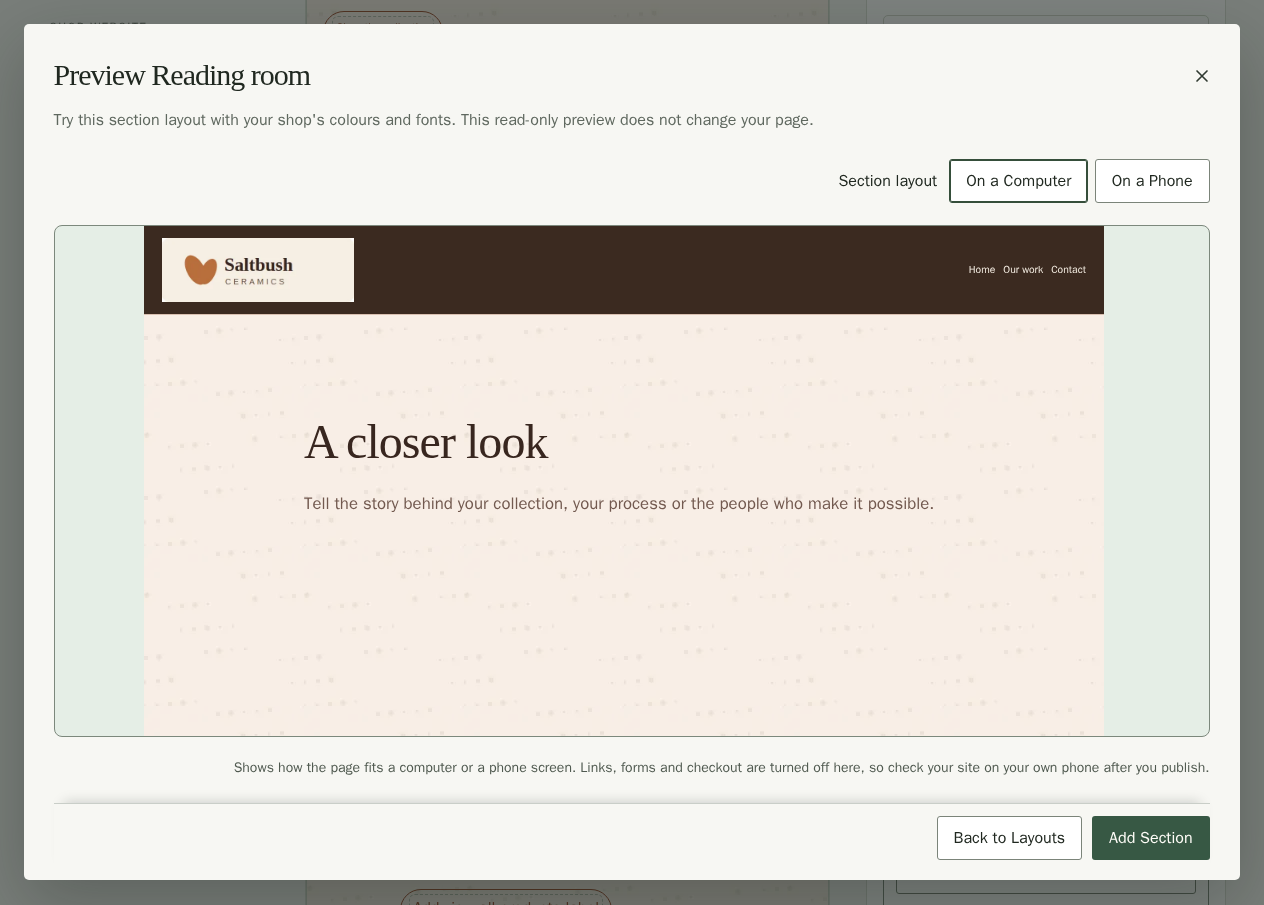
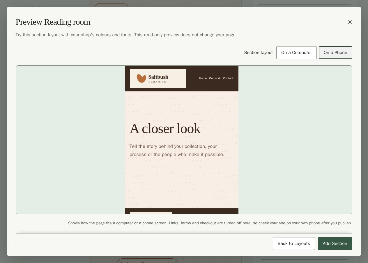
- In Choose a Section Layout, choose Preview Layout beside a layout. Its preview uses your current site style and shows only that section.
- Choose On a Computer or On a Phone to compare sizes. Links, forms and checkout are turned off. Picture layouts may stay empty until you add your own photos after adding the section. Product layouts show your published products, or say No products yet until you publish some; no sample products are added.
- Choose Back to Layouts or press Escape to return to the same search and category without changing your page.
- To use the layout, choose Add Section. It adds one independent section at the end of your page. Edit it, then choose Publish Site when ready.
Help Customers Browse and Sign Up
- Open Page Settings, choose your page, then open Sections and Choose a Section Layout.
- Choose Products and search in Layout category for Find a product or Product showcase. Choose Questions and signup for Newsletter invitation.
- Choose the layout, then edit its words and options in Section Settings.
- Choose Publish Site when ready.
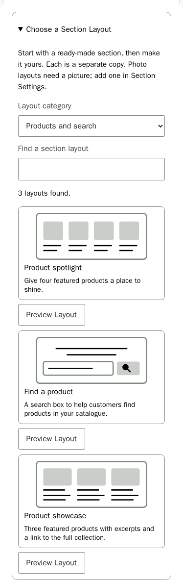
Find a product starts with a search box headed Find your next favourite, in a narrower text column on a soft tint of your palette. It searches your published products and opens the page with your full catalogue. Keep a Products section set to the full list on one page. The search follows that page if you rename its address.
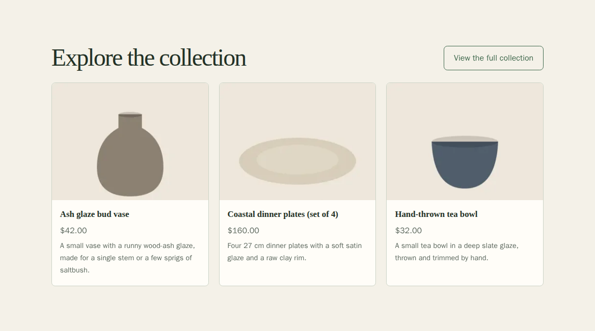
Product showcase starts with three published products, description excerpts and a View the full collection link. Category and stock lines start hidden. Use the Products section's existing controls to change the number of cards, choose one collection or pick products yourself. Its link opens your full catalogue page.
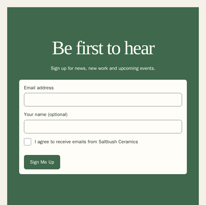
Newsletter invitation starts with Be first to hear, a short invitation and a Sign Me Up button, centred in a narrow section with your accent background. The editing preview shows a note in place of the protected signup form. On your published site, customers enter their email address and tick the consent box themselves. The consent wording is fixed, and the box starts unticked. They must confirm through the email they receive before joining your list. See Subscribers.
Add Questions and Answers
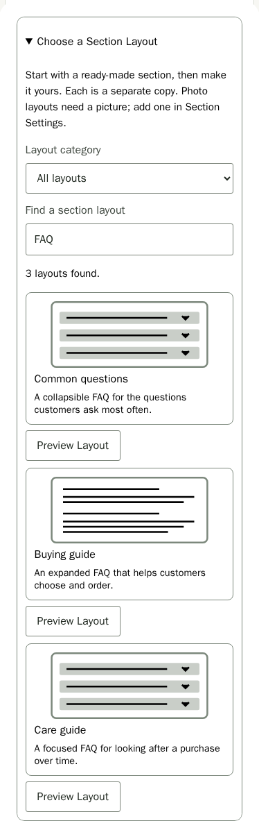
Answer common buying or care questions on your page. Each FAQ layout starts with three example pairs for you to replace. Common questions and Care guide have collapsible answers. Buying guide shows every answer. Care guide also starts as a narrower text column on a soft tint of your palette.
- In Page Settings, open Sections and Choose a Section Layout.
- Enter FAQ in Find a section layout, then choose Common questions, Buying guide or Care guide.
- In Section Settings, enter an optional FAQ heading.
- Set Answer display to Collapsible answers or All answers visible.
- Replace each Question and Answer with your own words. Both need text. Answers keep your line breaks; links and formatting are plain text.
- Choose Add Question for another pair, up to 12. Replace the new example question and answer before publishing.
- Use Move question 1 up or Move question 1 down to reorder a pair, or Delete question 1 to remove it.
- Choose Publish Site when your answers are ready.
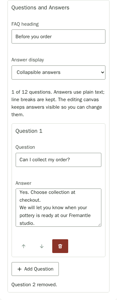
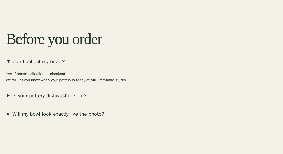
The editing canvas keeps answers visible so you can change them. Your published site follows Answer display: visitors open each collapsible question to read its answer, or see all answers at once. Open Section Appearance to change width, spacing, heading size, alignment or background. Removing every pair keeps the empty section off your published site. Saving keeps your changes private until you publish.
Add a Photo Gallery
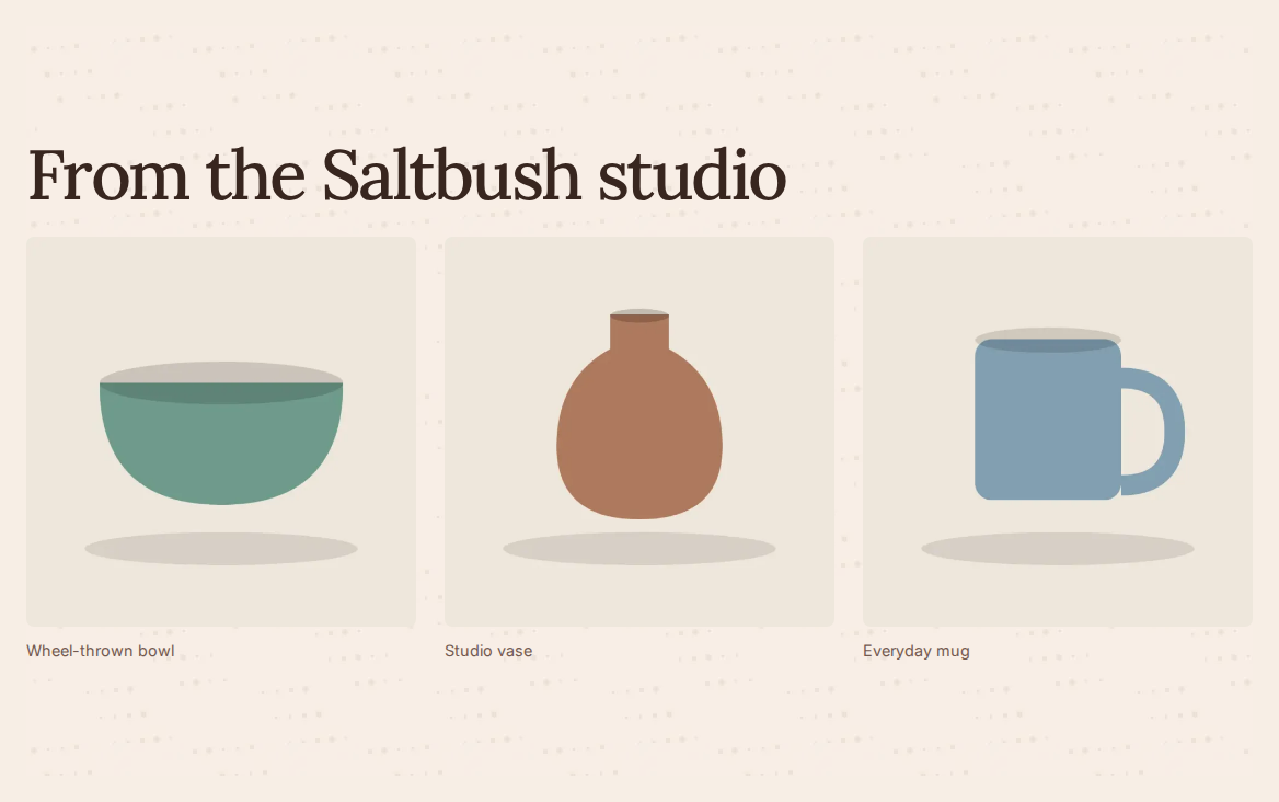
Use a gallery to show several views of your work together. The three picture layouts start empty, so add your own photos before publishing. A gallery without pictures stays off your live site.
- In Page Settings, open Sections and Choose a Section Layout. Search for a picture layout, then choose Photo grid, Paired pictures or Studio strip.
- In Section Settings, enter a Gallery heading and choose Gallery columns to show two, three or four pictures across on wider screens. The layout adjusts for smaller screens.
- Choose Add gallery pictures beside Gallery pictures and select JPEG, PNG, WebP or GIF photos of up to 10 MB each from your device. You can add several at once, up to 12 in one gallery. A file that is too large or not a picture is named beside the control and nothing uploads until you choose again. Wait for each upload to finish.
- For each picture, say what is in it in Picture description so people using a screen reader can understand it; a picture without one is flagged until you write it. Add an optional Caption to show words below the picture.
- Use Move picture 1 up or Move picture 1 down to change its order. Choose Replace picture 1 to use another file, or Remove picture 1 to take it out of this gallery.
- Choose Publish Site when the gallery is ready for visitors.
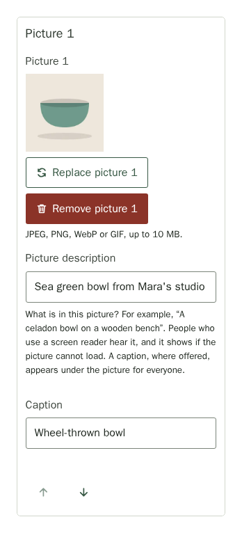
Changing the order or removing a picture from the gallery leaves its uploaded file in your media library. To change how gallery pictures fill their frames, open Image Framing. Gallery pictures start cropped to a square in Photo grid, a landscape shape in Paired pictures and a wide shape in Studio strip. Choose Original proportions to show each photo in its own shape; fit and focus controls are then unavailable. Open Section Appearance to change spacing, width, heading size, alignment or background.
Frame a Section's Picture
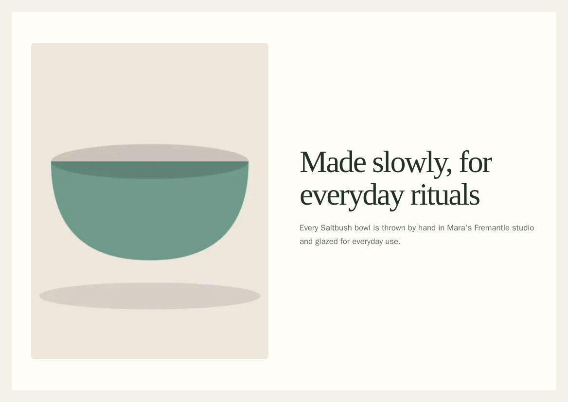
Select a Top banner, Text, Image or Gallery section in Page Settings and open Section Settings. Add a picture: Image Framing sits under it and opens by itself, with your picture shown the way the page will frame it. Each choice below changes that thumbnail straight away.
- Choose Image shape: Match the layout (default), Original proportions, Square, Landscape, Portrait or Widescreen.
- For a fixed shape, choose Image fit. Fill the frame (crop) crops the picture to fill it; Show the whole image keeps the entire picture visible.
- Choose a position under Image Focus to keep that part in view when cropped; the grid over the thumbnail shows the nine positions. You can use the arrow keys to move between them.
- Choose Publish Site when ready for customers to see it.
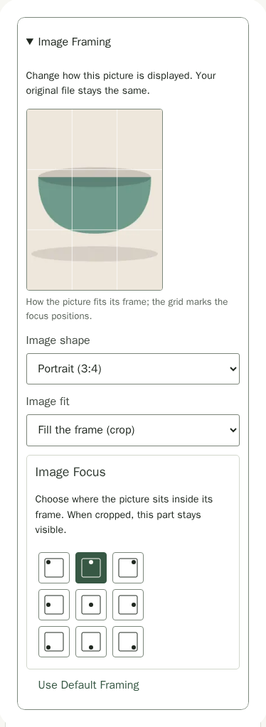
Original proportions keeps the picture's own shape, so fit and focus are unavailable. A Top banner picture behind the text always fills its banner: only focus applies. Switching it beside the text brings your shape and fit choices back. Choose Use Default Framing to restore the section's original picture layout. Framing applies on every page using this section and leaves your uploaded file unchanged.
Change Colours, Fonts and Corners
Open Site Settings and find Overall Look and Fonts in the Look group. These choices apply across your site. Each one is a set of cards that shows what it does, and the card marked Recommended suits most shops.
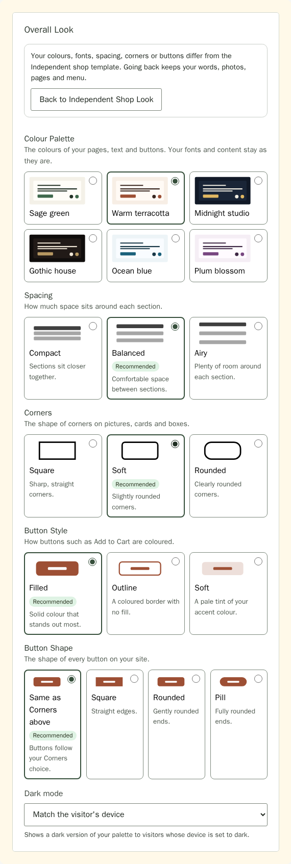
- Under Colour Palette, choose a card: Sage green, Warm terracotta, Midnight studio, Gothic house, Ocean blue or Plum blossom. Each card shows the palette's page, text and button colours, and the chosen card has a darker border. This changes colours only. Use Explore Styles for a coordinated change to fonts, spacing and corners.
- Choose the Spacing: Compact, Balanced or Airy. This sets the vertical space between sections, the gap between a hero image and its action buttons, and the gap between buttons side by side.
- Choose the Corners: Square, Soft or Rounded, for pictures, cards and boxes.
- Choose Dark mode. Off shows your palette to everyone. Match the visitor's device shows a dark version of Sage green, Warm terracotta, Ocean blue or Plum blossom to visitors whose phone or computer is set to dark, in the same hues and with text that stays easy to read. Midnight studio and Gothic house are dark already, so the setting doesn't apply to them.
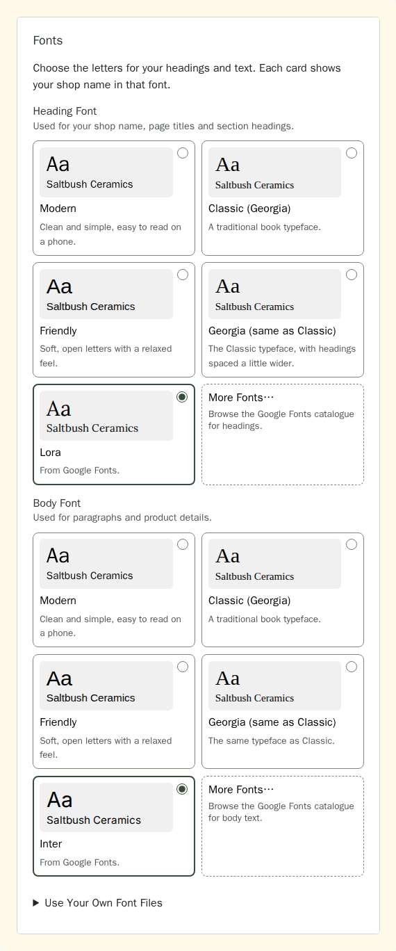
- Under Fonts, choose a Heading Font and a Body Font. Each card shows Aa and your shop name in that font. Classic (Georgia) and Georgia (same as Classic) use the same typeface; Georgia spaces headings a little wider. Fonts you upload and a Google font you choose appear as cards too. The heading font is also used for your shop name in the header when you don't show a logo.
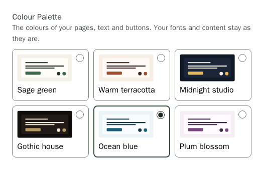
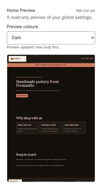
With dark mode on, Preview colours above the Home preview and the page preview switches them between the light and dark versions, so you can check both before you publish. Your header and footer colours and your photos stay as you set them, so check that your logo still reads well on a dark page.
Choosing a palette updates your editing preview. It also updates your header and footer, unless you chose your own header and footer colours. Your content, branding colours and Advanced CSS stay as you set them; these can override the colours you see. Check the preview, then choose Publish Site when ready to show customers.
Go Back to Your Template's Look
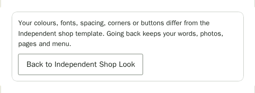
Tried a few palettes, fonts or buttons and want to start again? At the top of Overall Look, choose Back to <template> Look, such as Back to Independent Shop Look. It puts back your template's colours, fonts, spacing, corners, buttons and dark mode setting in one step. Your words, photos, pages, menu, header and footer colours and Advanced CSS stay as they are.
The button is unavailable while your look already matches the template. Choose Undo in the message that appears if you change your mind. Nothing changes on your live site until you choose Publish Site.
Choose Button Styles
Give your shop buttons a consistent look without changing your cards. Mara uses outlined, pill-shaped buttons for Saltbush Ceramics.
- In Site Settings, find Overall Look in the Look group.
- Under Button Style, choose Filled for a solid colour, Outline for a border, or Soft for a pale tint.
- Under Button Shape, choose Same as Corners above, Square, Rounded or Pill. Same as Corners above follows your Corners choice.
- Check the preview. Choose Publish Site when you are ready for customers to see it.
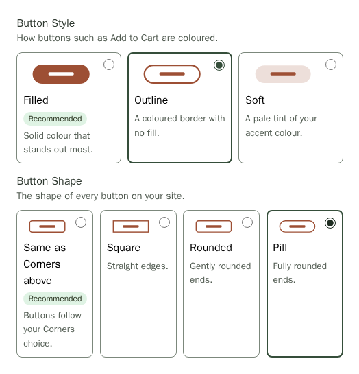
These choices apply to buttons across your shop and all pages. Filled and Same as Corners above keep the original appearance.
Duplicate a Section
Start with a section you already like, then change the copy for another story or offer. Each copy is separate: later edits to either section leave the other as it is.
- Open Page Settings and choose your page from Page beside the heading.
- Choose the section in Sections, then open Section Settings.
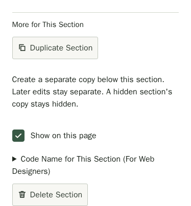
- Under More for This Section, choose Duplicate Section. The copy appears directly below the original, and Section Settings opens the copy.
- Edit the copy's words, pictures, links or appearance. Use Edit Another Section to see both sections in order.
- Choose Publish Site when ready.
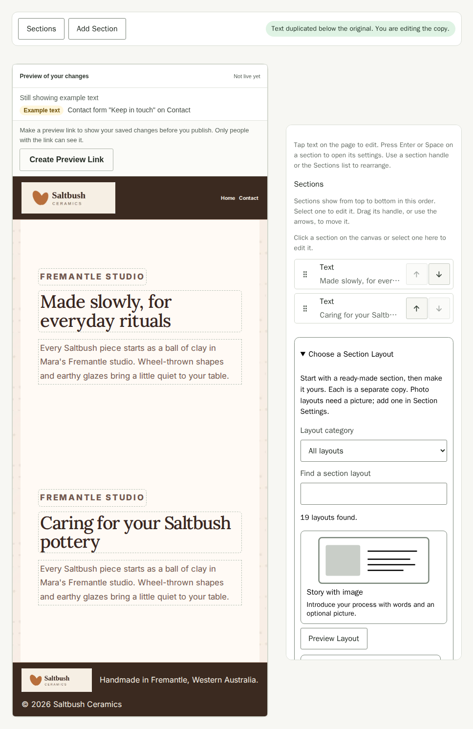
The copy starts with the same content, appearance and visibility. A hidden section makes a hidden copy. Pictures and other uploaded files are reused, so you do not need to upload them again. Duplicating does not save or publish: your live site stays the same until you publish. If your page has 60 sections or your site has 100 separate sections, the button is unavailable and explains which limit you have reached.
If you wrote Advanced CSS for the original section's ID, it still applies only to the original. Update those rules separately if needed.
To show the same section on several pages and keep their edits shared, reuse the existing section instead; see Site Pages. For a shared section already on this page, Make a Separate Copy for This Page replaces its shared connection without adding another section below it. Duplicate Section adds a separate section and leaves the original and its other pages as they are.
Style One Section
Use Section Appearance to make one section stand out. Start with a quick style, copy the look of another section, or adjust the choices yourself. Your words, pictures and links stay as they are. A shared section keeps the same appearance on every page that uses it. To style just this page, choose Make a Separate Copy for This Pagebefore changing its appearance.
- Open Page Settings and select the page from Page beside the heading.
- Choose the section in Sections, then open Section Settings.
- Open Section Appearance.
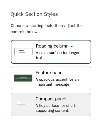
- Under Quick Section Styles, choose Reading column for narrow, balanced text with a medium heading; Feature band for a wide accent section with airy spacing, centred text and a large heading; or Compact panel for standard width, compact spacing and a small heading. Reading column and Compact panel use a soft tint background and left alignment. Each style replaces all five appearance choices below.
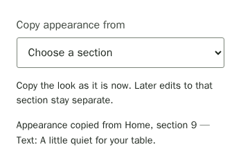
To reuse a look, choose a section in Copy appearance from. The list includes other sections in your shop with their own appearance choices, including sections on other pages. Each choice shows its page, position, type and a summary to help you tell similar sections apart. Copying replaces your current section's appearance choices. It makes an independent copy: later changes to either section do not change the other.
You can adjust any choice after applying a quick style or copying a look. A quick style is marked as selected only while all five choices match it.
These choices change only this section. Each list starts with Same as the rest of the site, which leaves that choice to your site's look.
- Choose Section spacing: No vertical padding, Compact, Balanced or Airy.
- Choose Section width: Narrower text column, Standard column or Full page width. The section stays within the page gutters on phones.
- Choose Heading size: Small, Medium or Large. This changes the section heading only. Card titles and headings inside your written text keep their size.
- Choose Section alignment: Left, Centre or Right.
- Choose Section background: Soft tint (surface colour) or Accent colour, both from your palette.
- Check the preview, then choose Publish Site when ready.
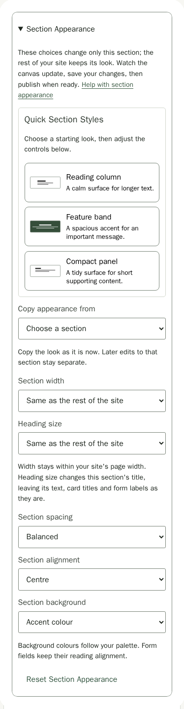
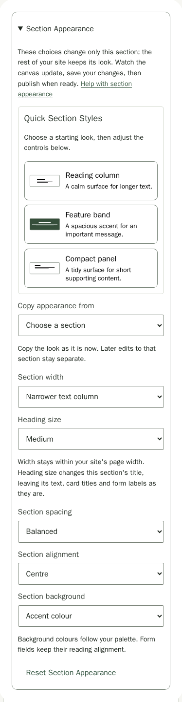
Choose Reset Section Appearance to clear all five choices at once, so the section looks like the rest of your site again. Save and publish to apply that reset to your live shop. You can keep editing privately before publishing.
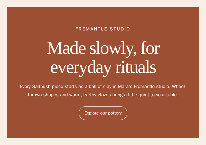
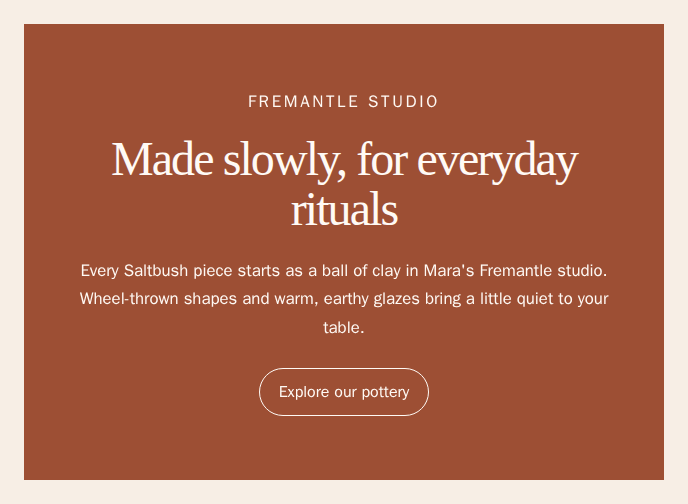
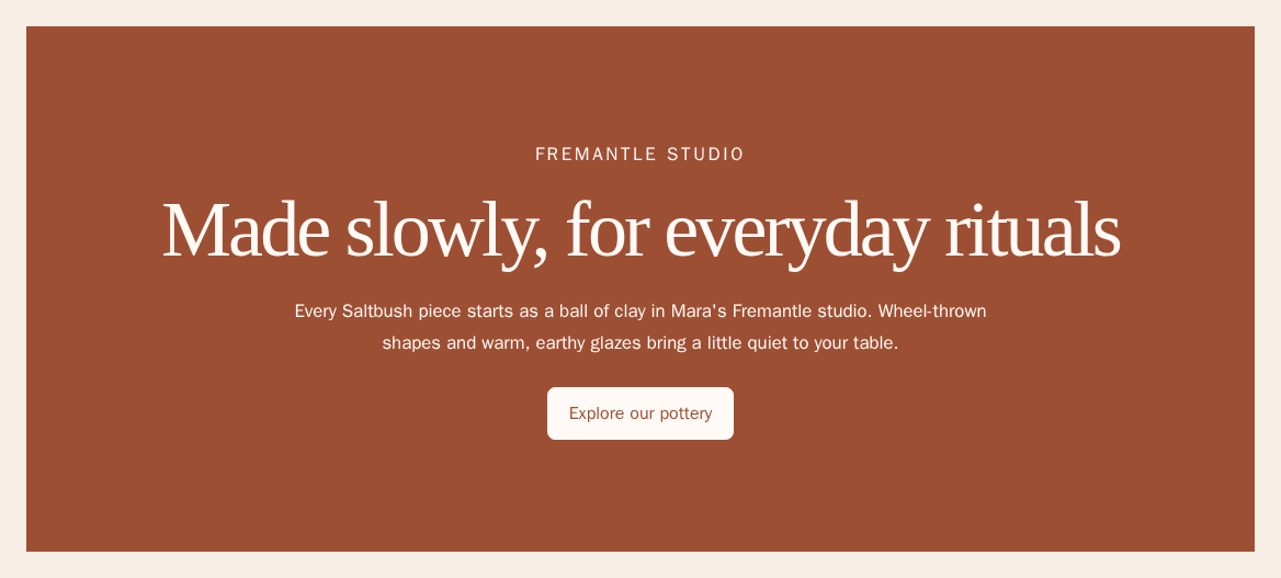
Choose Fonts from the Google Fonts Catalogue
Choose different fonts for your headings and body text without uploading files. Stallee hosts the fonts you choose for your site.
- In Site Settings, under Fonts, choose the More Fonts card under Heading Font or Body Font.
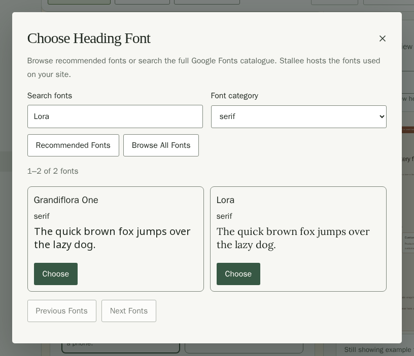
- Browse Recommended Fonts, or choose Browse All Fonts to explore the full catalogue.
- Enter a name in Search fonts, such as Lora, or choose a Font category. Use Next Fonts and Previous Fonts to browse more results.
- Each font shows a sample sentence in that font. Choose Choose on the Lora card to use it for Saltbush's headings.
- Choose More Fonts under Body Font and choose Inter for Saltbush's body text.
- Check the Home preview. Your live site stays as it is until you choose Publish Site and confirm.
Your choice appears as a card under Heading Font or Body Font, marked From Google Fonts, with a specimen in that font. To switch back, choose another card.
Preview the Design on Each Page
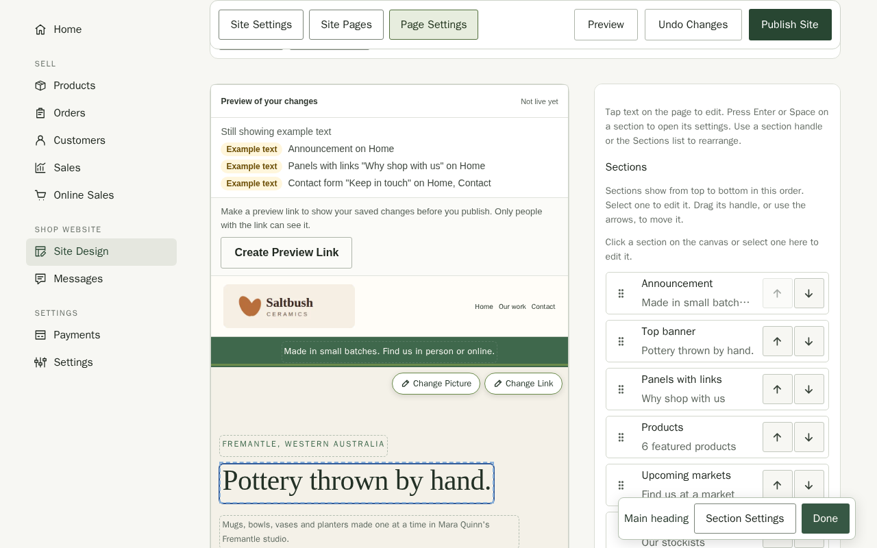
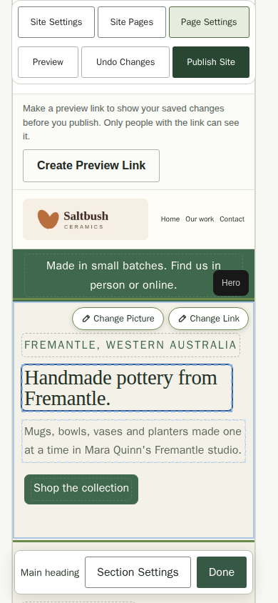
In Page Settings, choose a page from Page beside the heading to review its content. Use the Sections list to arrange sections, edit text in the preview, or open Section Settings for a section's options. See the Site Pages guide for editing page content.
Tap or click words on the canvas to edit them directly. Choose Done in the Text editing toolbar when you finish. On a phone, your save controls stay at the top while you work.
Use Your Own Fonts
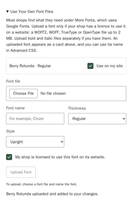
Most shops find what they need under More Fonts, which uses Google Fonts. If your shop has bought its own typeface, you can upload it instead. Stallee accepts WOFF2, WOFF, TrueType and OpenType files up to 2 MB, and they count towards your plan's image storage. Only upload a font your shop is licensed to use on a website.
- Under Fonts, open Use Your Own Font Files.
- Choose the Font file. Stallee suggests a Font name from the file name; change it if you like, such as to Cinzel.
- Choose its Thickness, such as Regular or Bold, and its Style.
- Tick the licence box, then choose Upload Font. Until a file, a name and the tick are in place, a line under the button says what is still needed. The font is added to your changes.
- Choose its card under Heading Font or Body Font.
Upload the bold or italic file of the same font separately, with the same name, if you have one. Untick Use on my site to stop using a font, then Delete it if you no longer need it.
Set Your Header, Footer and Accent Colours
Your header, footer and accent colour follow your colour palette unless you choose your own colours. The accent is the colour of links, focus outlines and any button you have not styled yourself. Choosing a new palette or template changes them too, and with Dark mode on they turn dark with the visitor's device. Buyer emails and the colour a phone's browser shows around your site use the same header colours.
- In Site Settings, under Header, Footer and Background in the Look group, leave Match my colour palette (recommended) selected to let the palette choose, or choose Choose my own to set the colours yourself. Your own colours start from the palette's and stay as you set them when you change palette.
- For each of Header background, Header text, Footer background, Footer text colour, Accent colour and Text on accent, choose Pick a colour to open a colour chooser, or choose a named swatch from your palette such as Card, Accent, White or Black. If a designer gave you a colour code like
#3b2a20, paste it into Colour code (optional). A code has six letters or numbers, with or without the#. When you set an Accent colour, Text on accent starts as white or near-black, whichever reads better on it. - If a note says Text may be hard to read or Links in this colour may be hard to read, the colours are too close in tone for comfortable reading. You can still save; try a lighter or darker colour. Choose Reset to Default beside Header, Footer or Accent to put that pair back to the palette's colours.
- Optionally choose the plus upload tile for Header texture or Footer texture and select an image. Set the Maximum logo width (between 120 and 480). A texture repeats across the bar in 512-pixel tiles, so a seamless pattern works best. Your logo shows up to 64 pixels tall.
- To lay a pattern behind every page, upload it as the Page background pattern. Then set the Pattern width, between 80 and 2000 pixels: the width each copy of the image takes up as it repeats across the page. Slide Pattern strength down to fade the pattern into your page colour; 100% shows it as uploaded. Use an image whose edges join up, so the repeat doesn't show. Choose the red delete icon beside its preview to go back to a plain background.
- Tick Use a separate logo on phones if you want a smaller logo on phones, then upload it as the Phone logo. Once it is uploaded, you can write a Phone Logo Description for screen readers.
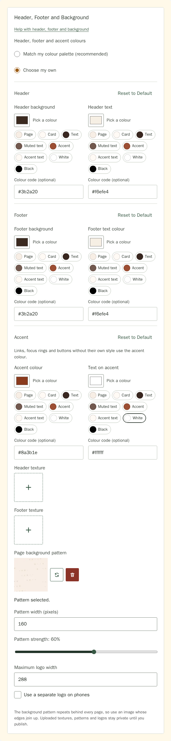
Each selected image has a preview with a replace icon and a red delete icon beside it. Choose replace to select another file, or delete to clear the image and bring back its plus upload tile. These controls also apply to your shop logo, browser icon and share image below. A page background pattern stays private until you publish. Keep it faint, so your words and photos stay easy to read over it.
Pick header colours that contrast well with your logo and text. If you type an incomplete or invalid code and move to the next field, the box shows an error; correct the code before saving.
Add Your Logo and Shop Details
- In Site Settings, choose Logo and Shop Details under Jump to.
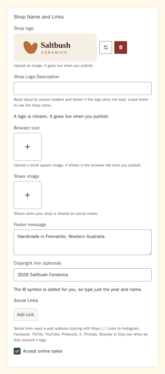
- In Shop Name and Links, under Shop logo, choose the square plus upload tile and select an image from your device. The same logo appears in your header and footer. Without a logo, both show your shop name.
- Write a Shop Logo Description that says what the logo shows, such as “Saltbush Ceramics, a gum leaf over a bowl”. Screen readers read it aloud, and it appears if the picture does not load. Your logo links to your home page, so a description that includes your shop name works best. Leave it blank to use the shop name. The browser icon is a tab icon that no one reads, so it has no description.
- Choose Browser icon and upload a small square image. It shows in the browser tab.
- Choose Share image and upload a picture. It shows when your shop is shared on social media. If you do not add one, your shop uses your home page picture or your logo.
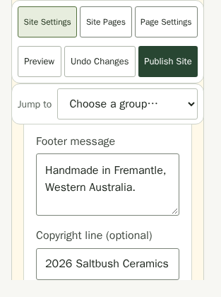
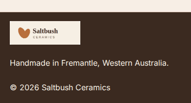
- Write your Footer message. New sites start with “Powered by Stallee”, which you can change or clear. Add a Copyright line (optional), such as 2026 Saltbush Ceramics, to show it in the footer too. The © symbol is added for you, so there is no need to find it on your keyboard.
- Add any Social Links with Add Link. Social links need an https:// address.
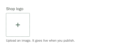
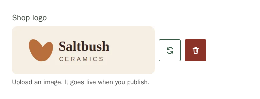
After you choose a file, its preview appears beside a replace icon and a red delete icon. Choose replace to select a different logo, or delete to remove it. The same controls fit beside the preview on a phone.
Your footer keeps your logo, message and copyright together with your policy and social links. Its text is sized for reading on computers and phones, and the logo links back to your home page.

The Accept online sales tickbox at the end of Shop Name and Links pauses checkout when you untick it, and shows customers your pause message instead.
Choose What Search Results Show
- In Site Settings, choose Search Engines and Analytics under Jump to.
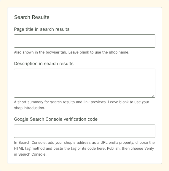
- In Search Results, set the Page title in search results. It also shows in the browser tab. Leave it blank to use your shop name.
- Write a short Description in search results. Search engines and link previews show it. Leave it blank to use your shop introduction.
Search Checklist, at the top of this group, lists what still helps search engines find and describe your shop: a shop description, a description for each page and picture, your own wording in place of the template's examples, your business details and Google verification. Each item reads your draft, shows Done once it is in place, and opens the view where you fix it. Nothing on the list is required.
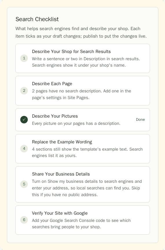
Verify Your Site with Google Search Console
Search Console is Google's free report of which searches show your shop and which pages Google has read. Google asks you to prove the site is yours first. Only an owner or admin can do this.
- In Google Search Console, add a property and choose URL prefix. Enter your shop's full address, such as https://saltbush-ceramics.stallee.xyz.
- Choose the HTML tag verification method and copy the tag Google shows.
- In Stallee, paste it into Google Search Console verification code. Stallee keeps only the code inside the tag.
- Choose Publish Site.
- Back in Search Console, choose Verify. Leave the code in place afterwards; Google checks it again from time to time.
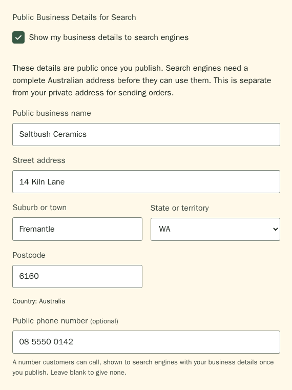
Show my business details to search engines, under Public Business Details for Search, lets you share a business name and address with search engines. The address is in your shop's country, which is Australia unless you set Shop Country in Online Sales to New Zealand, the United Kingdom or the United States. You can also add a Public phone number that customers can call. Leave it blank if you do not want calls; a number that is not a phone number is not saved. The details become public once you publish, and they are separate from your private sending address in Settings.
Stallee also tells search engines a few things for you, with nothing to set up. The questions and answers in a visible FAQ section are passed on, so a search result can show them. Each page says where it sits in your site, such as your shop, then Collections, then the collection. Every page also names its language, which follows Language and region in Settings. A collection page lists the products a visitor sees on it, and your site map tells search engines when you last published your site and when each product, collection and article last changed, so they know what to read again. A hidden section or an unpublished page is never passed on.
Show a Shared Storefront Announcement
Share a short message above your shop header, such as a new collection or studio opening. It appears across your published storefront pages, including products, collections, journal articles and the cart. This setting is available on Free. The separate Announcement section you can add to a page keeps its own content and position.
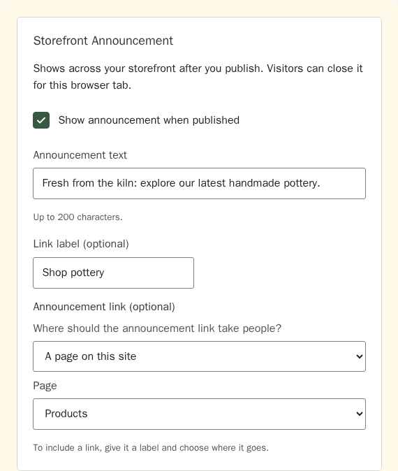
- In Site Settings, choose Announcement and Journal under Jump to, then find Storefront Announcement.
- Tick Show announcement when published.
- Enter Announcement text of up to 200 characters. Use plain text without formatting.
- To add a link, type a Link label (optional) of up to 80 characters. Under Where should the announcement link take people?, choose A page on this site and the page, such as Products; A section on the home page and the section; or Another website and its address starting with https://. Choose No link and clear the label to show the message on its own.
- Your announcement stays private until you publish.
- Check the announcement in your site preview. Closing it in a preview does not change whether it is closed on the live site.
- Choose Publish Site, then confirm Publish Site in the dialog when you are ready.

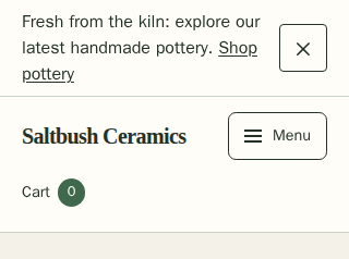
Visitors can close the bar for their current browser tab with Dismiss announcement. Publishing a changed message or link makes it appear again. Publishing unrelated site changes keeps an already closed announcement closed. Untick the setting, save and publish to remove it from your live site.
Enable Built-In Analytics
Built-in analytics is off by default. Only the shop owner and admins can change it.
- In Site Settings, choose Search Engines and Analytics under Jump to, then find Built-In Analytics.
- Tick Built-in storefront analytics.
- Choose Publish Site.
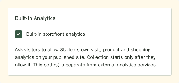
Your published shop asks visitors before collecting built-in analytics. Refusing does not stop shopping. Visitors can reopen Analytics Choices in the shop footer and withdraw consent. Privacy signals can prevent collection. The built-in choice does not authorise any external analytics service.
Untick the setting, save and publish to stop new collection. Read the Analytics guide for how visits progressed, exports, retention and permanent deletion.
Connect Visitor Analytics
Visitor Analytics is optional: skip it unless you already use Google Analytics 4, Cloudflare Web Analytics or Plausible. If you do, you can connect one of them to see visits to your shop there. Stallee adds that service's code to your published site only.
- In Search Engines and Analytics, under Visitor Analytics, choose your Analytics service.
- Enter the value from that service: your Google Analytics measurement ID (it starts with G-), your Cloudflare Web Analytics token, or your Plausible domain name. Enter only the value shown, not the code around it or a web address. The Where to find this line under the box says where that service shows it.
- Choose Publish Site when you are ready for visitors to see the change. Choose No analytics service to remove it, then publish again.
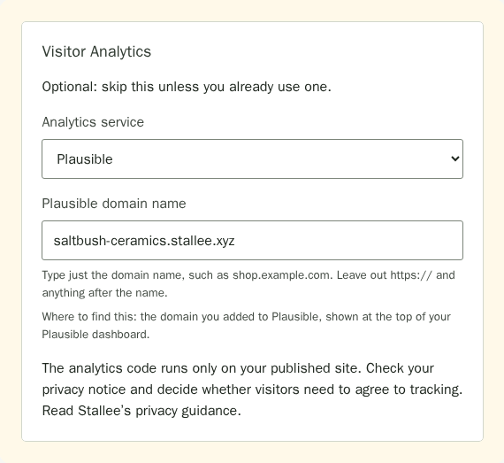
If the value is not one the service uses, saving stops and the message names that service, such as Check your Plausible domain name. Correct the value and save again.
The analytics service may receive visitor information under its own privacy terms. Update your shop's privacy notice and decide whether you need visitor consent. You are responsible for any consent your shop needs for that external service. The built-in analytics choice does not provide consent for external services.
Google tag setup · Cloudflare Web Analytics setup · Plausible script guide
Add Advanced CSS for Web Developers
Advanced CSS is for someone who writes CSS, the code that styles web pages. You can build a whole site without it. It sits last in Site Settings: choose Advanced under Jump to, read For Web Developers, then open Advanced CSS and type into Your CSS. The rules Stallee allows are listed under the box.
If you know CSS, Advanced CSS accepts finishing touches such as letter spacing, colours, gradient backgrounds and your uploaded fonts. Use :scope to style the whole page (a gradient background-image there sits beneath your page background pattern), @media (max-width: 640px) for phone-only changes, and @media (prefers-color-scheme: dark) for changes to the dark version when dark mode is on. To shade a top banner photo that sits behind the text your own way, give .storefront-hero-backdrop::after a gradient background-image. To style buttons, use .button for every button and .storefront-button--secondary for the banner's second button, with :hover if you like. You can change their colours, gradients, borders, corners, shadows and lettering; their size and spacing stay as they are, so pick colours that are easy to read. To make the whole site wider or narrower, set --storefront-page-width on :scope to a width from 960px to 1600px, for example :scope { --storefront-page-width: 1232px; }. To colour the links in your header, use .site-nav a and .site-nav a:hover.
Cards and panels can glow and lift when a customer points at them. Give a card a glowing edge with border-color and a coloured box-shadow, then style its pointed-at state with :hover, or :focus-within for someone moving through the page with a keyboard. Both work on .feature-card (highlight and market cards), .storefront-product-card and .contact-form-panel; .storefront-text-body (a text section's box) and .storefront-text-image (its picture) take :hover only. A card or panel's pointed-at state takes colours, gradients, border colour, a shadow up to 64px and transform; a picture's takes border colour, shadow and transform. Size and spacing stay as they are, so nothing else on the page moves. transform takes one of translate, translateX or translateY up to 12px and one scale from 0.95 to 1.05. It works only on those pointed-at states and on a button's :hover and :focus-visible, where it moves up to 4px. To make the change ease in, give the card, panel, picture, button or header link a transition of up to five of color, background-color, border-color, box-shadow or transform, each up to 600ms, for example:
.feature-card {
  border-color: #f5801e;
  box-shadow: 0 0 12px rgba(245, 128, 30, 0.35);
  transition: box-shadow 200ms ease-out, transform 200ms ease-out;
}
.feature-card:hover,
.feature-card:focus-within {
  box-shadow: 0 0 24px rgba(245, 128, 30, 0.6);
  transform: translateY(-4px);
}
Customers whose phone or computer is set to reduce motion see the glow change without the lift or the easing.
Without Advanced CSS, your products fill as many columns as fit, up to four: one on a phone, two on a small tablet, three on a laptop and four on a wide screen. On a tablet or phone your page links fold behind a Menu button, so the header stays one row.
Advanced CSS can also set how many columns a grid has, from one to four, with grid-template-columns: repeat(3, 1fr) or repeat(3, minmax(0, 1fr)). It works on .storefront-product-grid (your products), .storefront-featured-products .storefront-product-grid (featured products), .feature-grid (every card grid) or .highlights-section .feature-grid, .storefront-markets .feature-grid and .storefront-stockists .feature-grid (one list at a time), and on .contact-layout. Your column count applies on phones too, so add a phone value inside @media (max-width: 640px), for example .storefront-product-grid { grid-template-columns: repeat(1, 1fr); }.
The contact form's words and its form sit in .contact-intro and .contact-form-panel, inside .contact-layout, which is one column until you set grid-template-columns and gap on it. Give .contact-section a max-width of 100% to give two columns room. On product pages and cards you can style .storefront-product-detail, .storefront-product-description, .storefront-product-attributes, .storefront-product-gallery, .storefront-product-main-image, .storefront-product-card-copy, .storefront-product-card-title, .storefront-product-card-price, .storefront-product-category and .storefront-product-excerpt. Stockist links, .stockist-website-link and .stockist-map-link, take the same colours, borders, corners, shadows and lettering as buttons. A divider in text can have its border-color, border-width (up to 8px) and margins set with .text-section hr, and a quote can be styled with .storefront-prose blockquote. The footer message and copyright line are .site-footer-tagline and .site-footer-copyright. A top banner photo keeps its middle in view when it is cropped; to keep another part in view, set object-position on .storefront-hero-image, for example object-position: 0% 75% for the lower left. It takes one or two of left, center, right, top, bottom or a percentage, and nothing else.
To style one section on its own, select it under Sections in Page Settings, then open Code Name for This Section (For Web Designers) under More for This Section in the inspector, for example #our-story. Write that on its own to style the section (colours, borders, corners, spacing, width and lettering, like .site-section), or put a selector from inside a section after it, such as #our-story h2, #our-story .button or #our-story .storefront-text-image. You can use h1, h2, h3, p, a, hr, figcaption, .button, .storefront-button--secondary, .storefront-eyebrow, .storefront-prose, .storefront-text-body, .storefront-text-media, .storefront-text-image, .storefront-text-actions, .feature-grid, .feature-card (and its h3 and p), .contact-layout, .contact-intro, .contact-form-panel, .storefront-product-grid, .storefront-product-card and its parts, .stockist-website-link and .stockist-map-link, .storefront-prose blockquote, .storefront-hero-image and .storefront-hero-backdrop::after. Each one takes the same properties and limits as it does without the name. The page header, menu, footer, brand and product page can't be addressed this way. A rule with a name wins over the same rule without one. When you edit your CSS, Stallee refuses a name that isn't a section on your site. Deleting a section its rules name still saves: your site simply ignores those rules, and Stallee asks you to remove them the next time you edit your CSS. A text section's picture is .storefront-text-image; it takes borders, corners and a shadow.
Stallee blocks anything unsafe, such as imports, web addresses, overlays or hidden content, and links keep your palette's colours. If Stallee refuses your CSS when you save, the message names the selector, property or value to change.
Show One Collection in a Products Section
Use a Products section to show a collection within an existing page, such as Small Gifts on Home. Create a page and any automatic rules in Collections first and choose Save Collection. Saved private drafts are available in the picker. You can select the label here, then publish the section and collection rules together with one Publish Site.
- Open Page Settings and choose the page from Page beside the heading.
- Select its Products section, then open Section Settings.
- Set Products to show to One collection.
- If needed, enter its name in Find a collection and choose Search Collections.
- Choose the label in Collection.
- Choose Publish Site when it is ready.
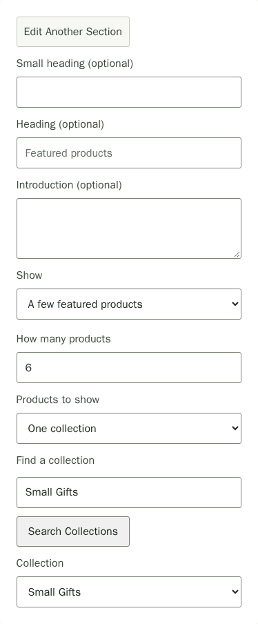
Published rules add matching products alongside products with that exact manual label. The full product list, collection page and embedded section use the same membership. On Free, collection filters apply within the shop's earliest 20 published products; a new section does not increase that limit.
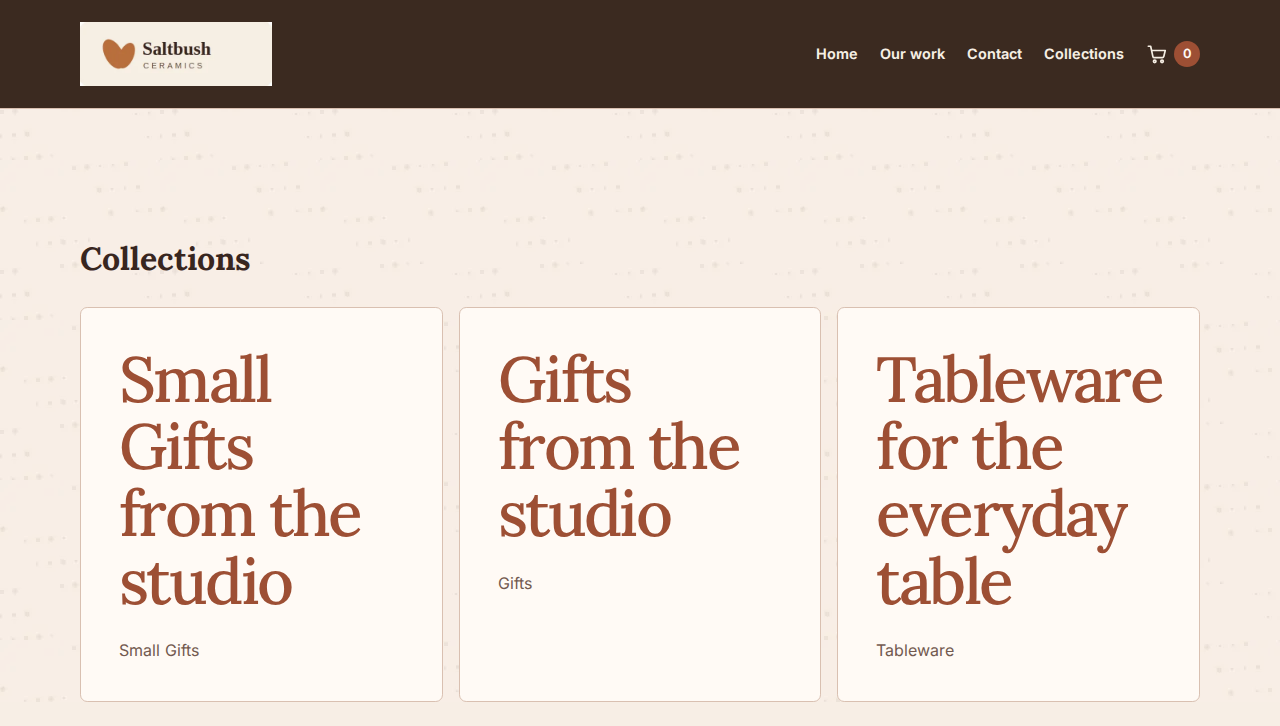
Publishing your first collection page adds Collectionsto your site's navigation automatically. It opens the collection index; each collection then has its own page under /products/collections/. Draft collection pages stay private.
Add a Search Box and Let Buyers Sort
In Page Settings, choose Search Box under Add a section, then Add Section, and move it where you want it on any page, such as under your top banner on Home. Add an optional heading and hint, then save. When a buyer searches, Stallee opens the page that shows your full product list with their words applied, so you need one Products section set to the full list. Only published products appear, and the search follows the full list page if you rename its address. The Products list also has its own search box. Buyers can order that list with Sort By: Featured, Newest, Price: Low to High, Price: High to Low or Name A–Z. The order is part of the page address, so a buyer can share a sorted list. If nothing matches a search, the list says so and offers Clear Search.
Preview Your Changes
The preview beside Site Settings shows your site settings. Use Page Settings to preview page content and select a page from Page beside its heading.
- Wait for Changes saved in the corner. To see your draft as customers will, choose Preview. It opens in a new tab at full width, only for people signed in to your shop, and the Page list there switches pages.
- To show your changes to someone else first, choose Create Preview Link in Page Settings. Choose Open Preview to see it yourself in a new tab or Copy Link to send it. Anyone with the link can see your saved changes until it expires. If you come back later, Stallee tells you a link exists and until when; choose Make a New Link to get an address you can share again. Choose Turn Off Preview Link to switch it off.
Publish Your Site
- Choose Publish Site.
- If a required field is empty, Site Design opens the page and focuses the field. Fill it in, then choose Publish Site again.
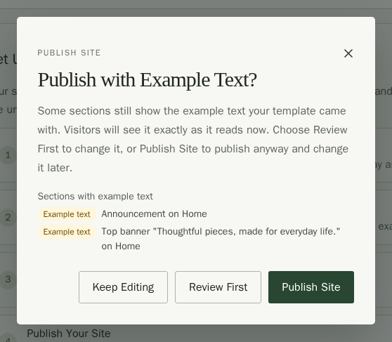
- If any section still shows example text, the confirmation lists it. Choose Review First to open the first one in Page Settings, or Publish Site to publish anyway and change it later.
- Confirm publishing. The corner message says your changes are live, and View your site in it opens your site in a new tab.
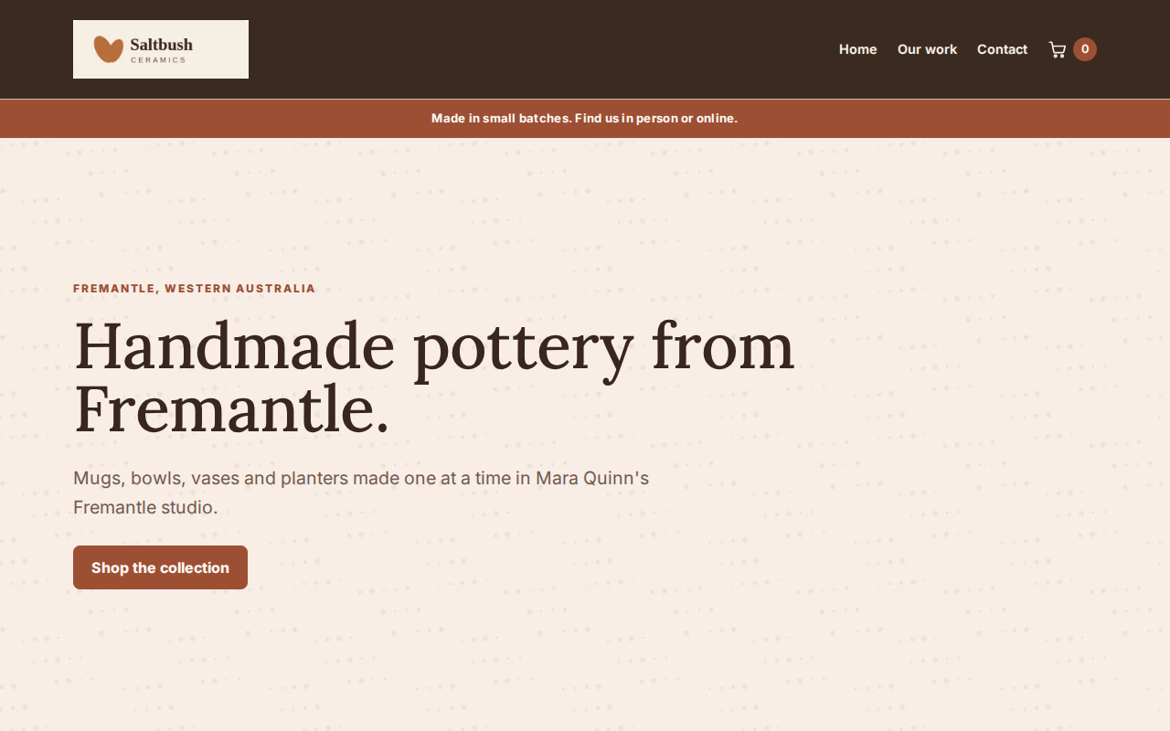
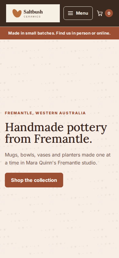
By default, the top banner fills the screen below your menu on computers and phones. Longer words or a picture can make it taller, so visitors can scroll to read everything and reach your buttons. Choosing Section spacing sets the banner's padding and removes its full-screen minimum height.
Publish Site saves any last edit first. You can continue editing and publish again whenever you like.
Undo Your Changes
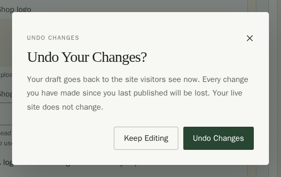
Tried something you do not want to keep? Choose Undo Changes in the toolbar. It replaces your draft with the site visitors see now, so changes you have not published go too. It does not change what customers see. Confirm Undo Changes in the Undo Your Changes? dialog, or choose Keep Editing to stay as you are. The button is greyed out until you first publish, and while your draft already matches your live site. If your live site has more pages than your plan now allows, or uses an image or font you have since deleted, it cannot be copied back: your draft stays as it is, and publishing it replaces your live site.
When Your Site Changed Elsewhere
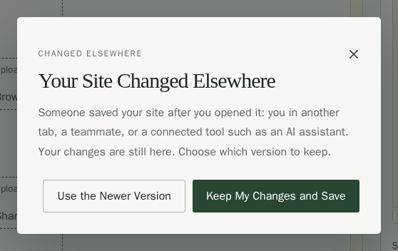
Sometimes your site is saved by someone else after you open Site Design: you in another tab, a teammate, or a connected tool such as an AI assistant. Stallee never saves over their work without asking. When you save or publish, Your Site Changed Elsewhere opens and your changes stay in the editor while you choose:
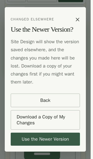
- Choose Use the Newer Version to see what was saved elsewhere. Before it replaces your edits, choose Download a Copy of My Changes if you might want them later, then confirm Use the Newer Version.
- Or choose Keep My Changes and Save. Stallee warns that this replaces the version saved elsewhere; choose Replace Their Changes and Save to save yours, or Back to choose again.
If the newer version could not be loaded, your edits stay in the editor. Choose Try Again. Once the newer draft loads, the warning clears and you can choose which version to keep.
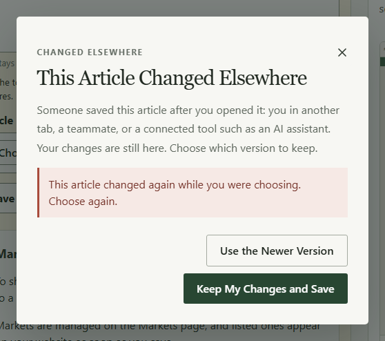
Journal articles work the same way: saving an article someone changed elsewhere opens This Article Changed Elsewhere with the same choices. If the article changes again while you are choosing, the choices open again with the newest version available. Your edits stay in the editor. To replace the newest version, choose Keep My Changes and Save, then Replace Their Changes and Save again.
If the newest article cannot load, your edits stay in the editor. Choose Save Article again to check for the newest version.
If Stallee cannot be reached while you save, the message says so and your changes stay in the editor; save again once you are back online. If Site Design itself cannot load, it says so with a Try Again button, and asks you to sign in again first if your sign-in has ended.
What Next
- Manage page details and menu links in Site Pages, then edit page content in Page Settings.
- Use your own domain in Website address.
- Add the things you sell in Products.