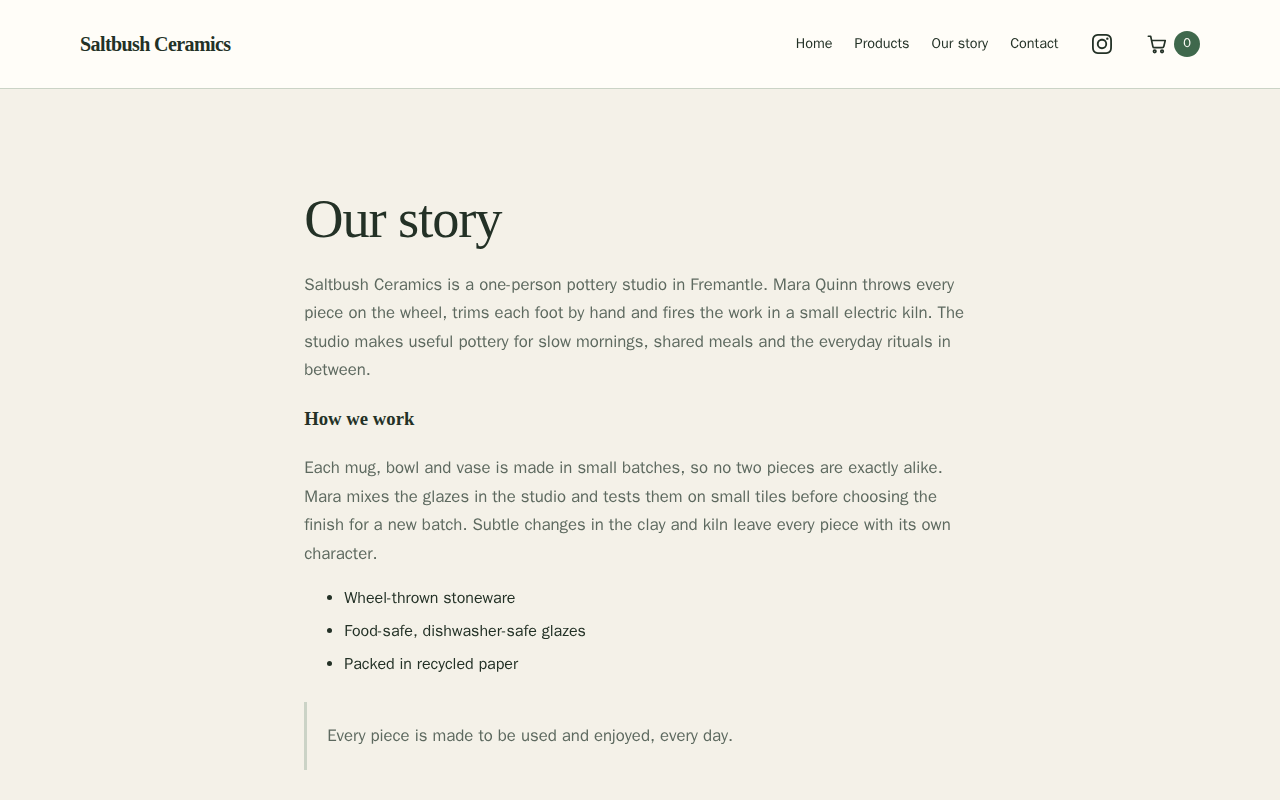
Site Pages is where you add pages, edit their details and choose which links appear in your menu. Open Page Settings to edit a page's content and sections. Your changes stay private until you publish. This guide follows Mara Quinn adding an Our story page to the Saltbush Ceramics site.
To write dated stories for your site, see the Journal guide.
Open Site Pages under Shop website; there, Help with Site Pages opens this guide. Choose a page and select Edit Page Content to open Page Settings. Stallee saves your changes by itself a moment after you stop editing, and Changes saved appears in the bottom corner; publishing is a separate step. Preview opens your saved draft in a new tab, only for people signed in to your shop.
See Your Pages
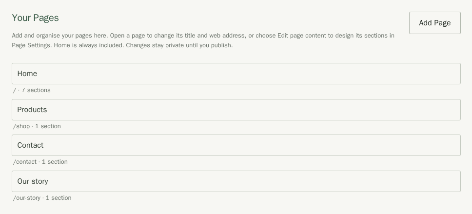
Site Pages lists Home and the pages you add, with each page's title and web address. Choose a page to edit its details or open its content in Page Settings.
Start with a Page Layout
A page layout gives you a new page with sections and starter guidance to make your own. It leaves your existing pages alone.
- In Site Pages, choose Add Page.
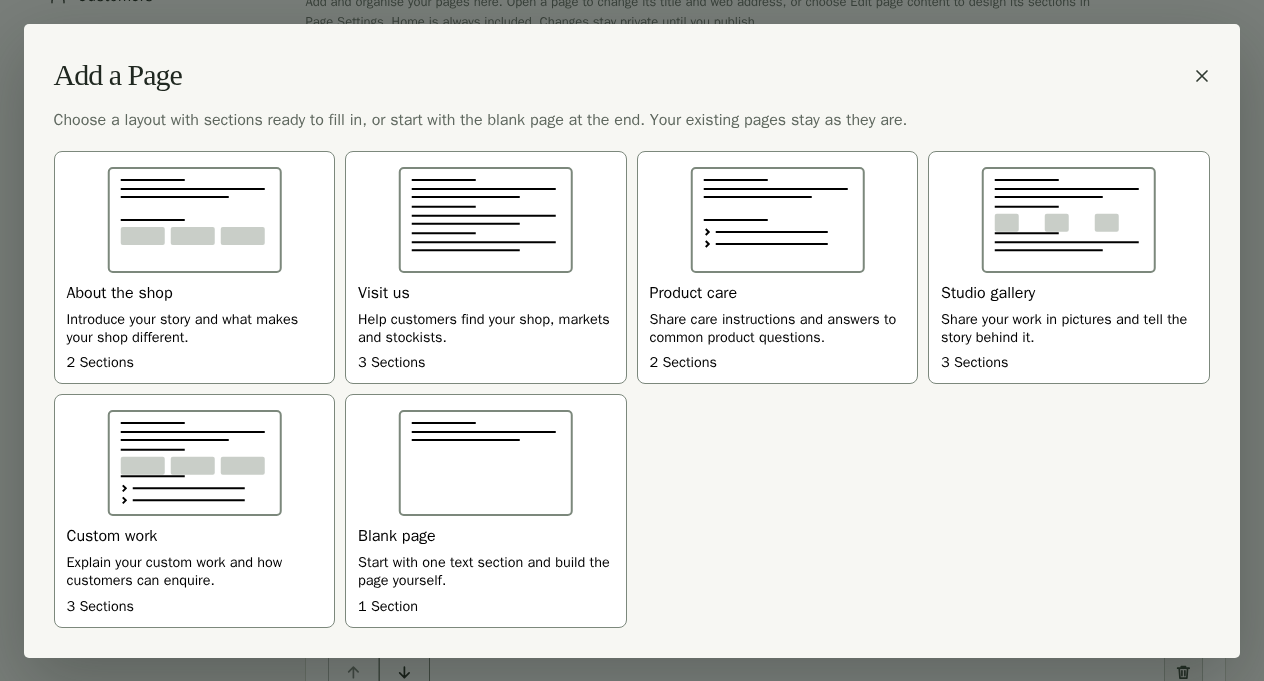
- Choose About the shop, Visit us, Product care, Studio gallery or Custom work to preview it. The layouts come first; Blank page is last.
- Compare the complete page On a Computer and On a Phone in your current site style. On a phone the preview starts at phone size. Links, forms and checkout are turned off in the preview.
- Leave Add to Menu ticked to put the page in your menu, named after its title, or untick it to add the page without a menu link.
- Choose Create Page to add it to your unsaved draft. A message says whether the page is in your menu.
- Choose Edit Page Content.
- Replace the starter guidance with your own words.
- Choose Publish Site when it is ready for customers.
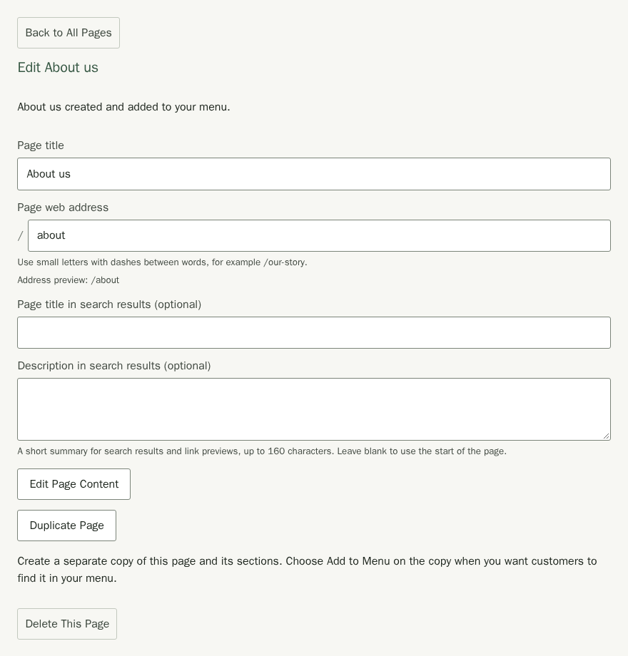
To look at another choice, choose Back to Choices. To return without changing anything, choose Cancel or press Escape. After creating a page, you can change its Page title and Page web address before opening its content. Check every section before publishing.
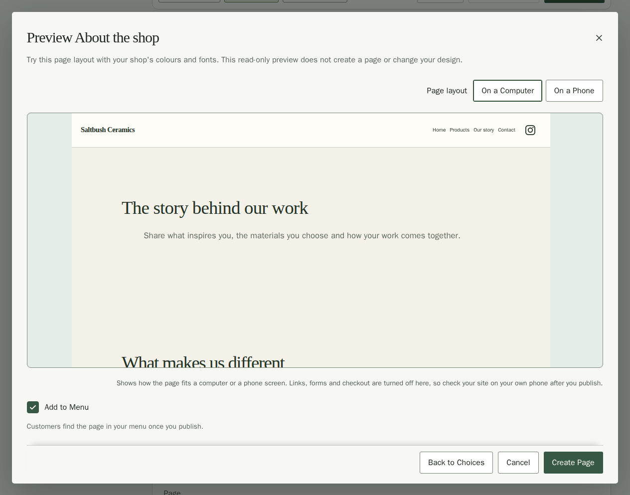
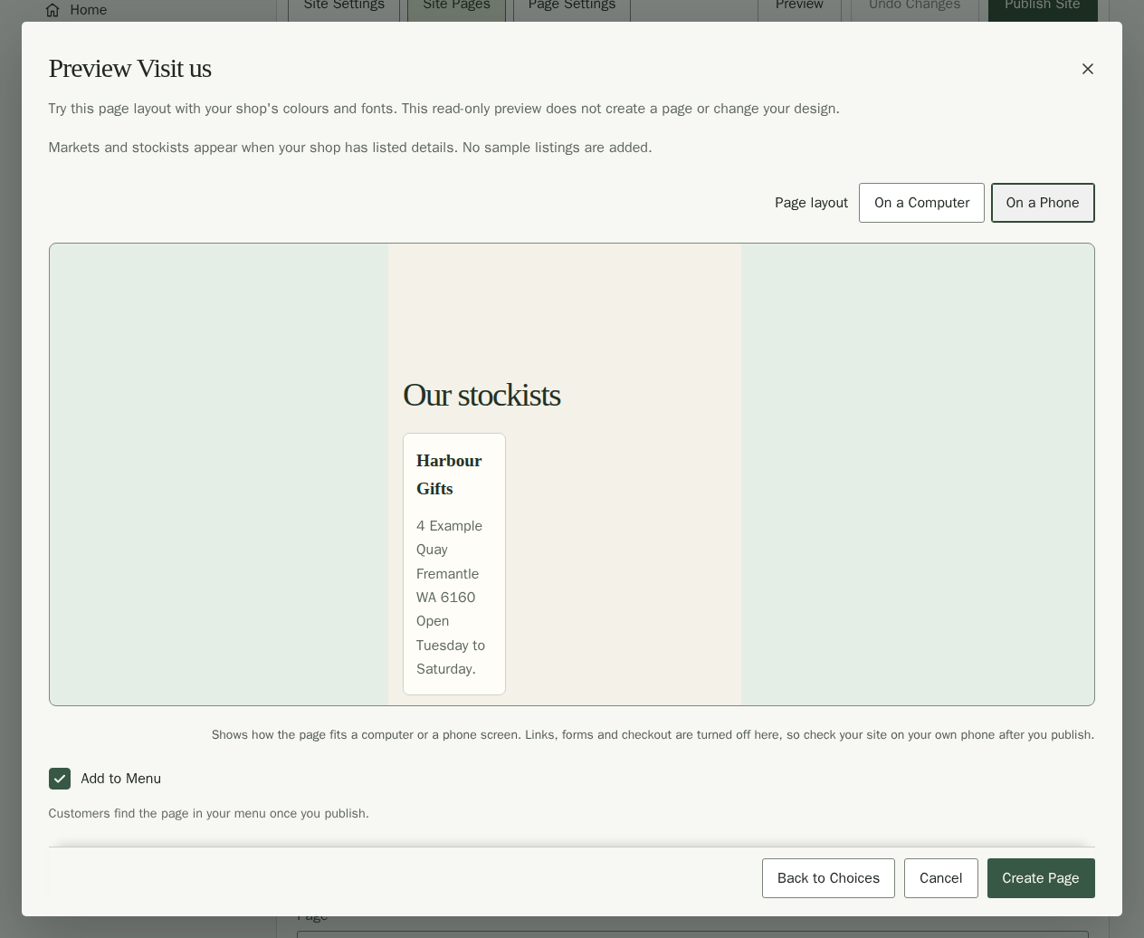
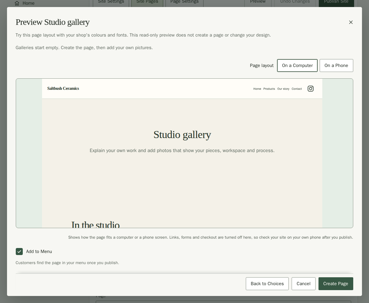
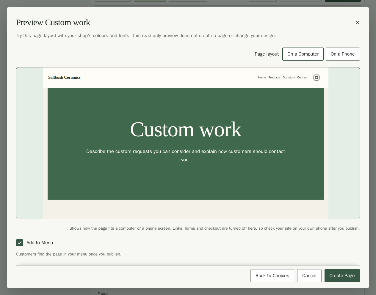
Previewing changes nothing. Scroll inside the preview to see the whole page; you can focus it with the keyboard and use the arrow keys to scroll. Choosing Create Page adds the page to your unsaved draft; saving and publishing are separate steps.
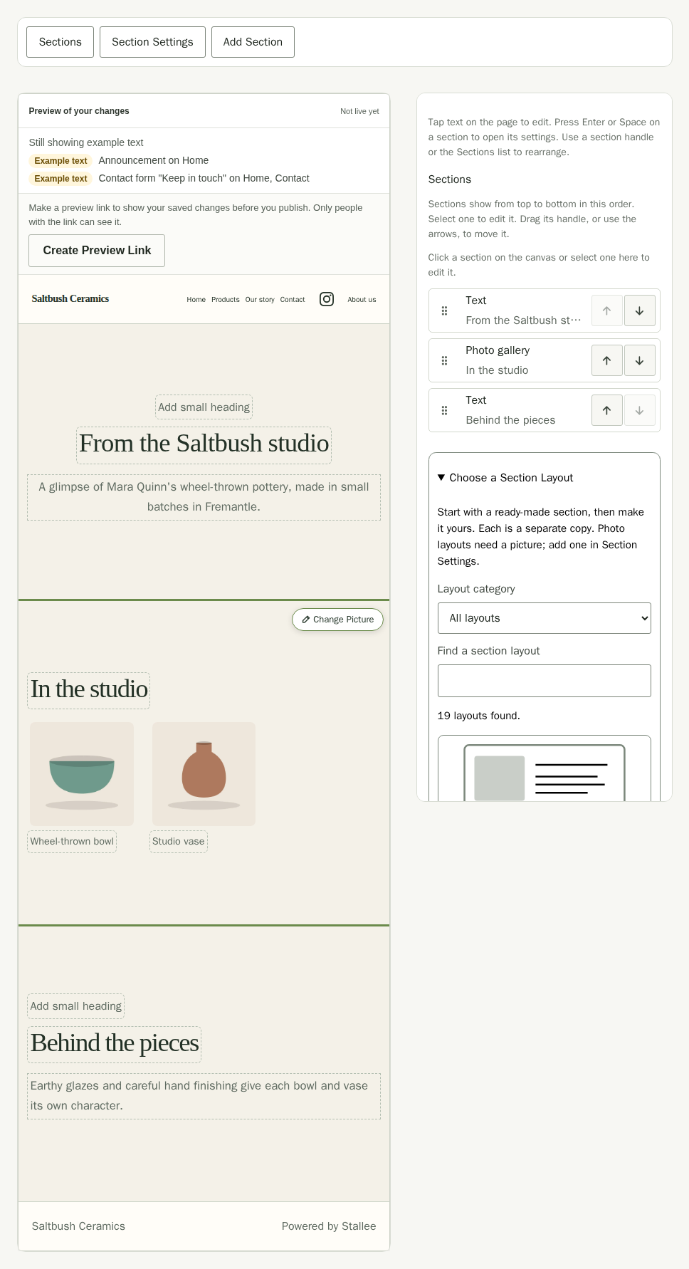
About the shop creates an About us page with Text and Panels with links sections. Visit us creates a Visit us page with Text, Upcoming Markets and Stockists sections. Product care creates a Care guide page with Text and Questions and answers sections. Each new page has its own sections; editing them does not change another page. Studio gallery creates a Studio gallery page with Text, Gallery and Text sections. Custom work creates a Custom work page with Text, Panels with links and Questions and answers sections.
If a text section shows Add your picture, choose Section Settings to add your own picture. The space starts empty. For Saltbush, Mara replaces the About us guidance with her studio story and explains what makes her pottery special.
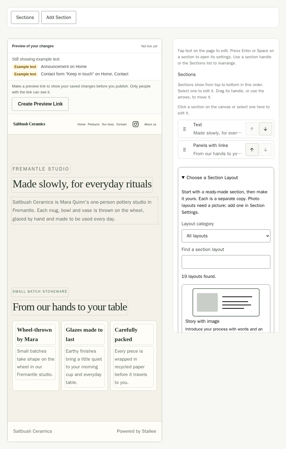
Galleries start empty. Create the page, then add your own pictures. For the Studio gallery page, use the Gallery section's existing picture, description and caption controls. See Add a Photo Gallery in Site Design for the fields. Mara adds pottery photos and replaces both Text sections with her studio introduction and a note about her work.
For Custom work, replace the introduction, three process panels and three questions with your own guidance. Check that every answer describes how you actually work before publishing. The layout adds no enquiry form or ordering service.
The Visit us preview shows your listed markets and stockists, with no sample entries added. Upcoming Markets and Stockists stay empty until you add entries in Markets and Stockists. The Visit us guidance does not add an address or contact details for you.
Duplicate a Page
Reuse a page you have already made, including Home. The copy keeps its sections in the same order, their appearance and which ones are hidden, plus the page's search details.
- In Site Pages, choose the page you want to reuse.
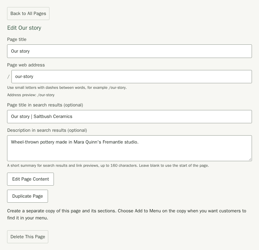
- Choose Duplicate Page. The new page's details open straight away.
- Change its Page title. For example, Our story becomes Our story (copy), with the address
/our-story-copy. Stallee adds a number if that name or address is already used. While the copy is not in your menu, its Page web address follows the new title; you can also type your own. Check the optional search title and description too. - Choose Edit Page Content and make the copy your own.
- Choose Add to Menu on the copy's details if you want customers to find it in your menu. See Add Pages to Your Menu below.
- Choose Publish Site when it is ready for customers.
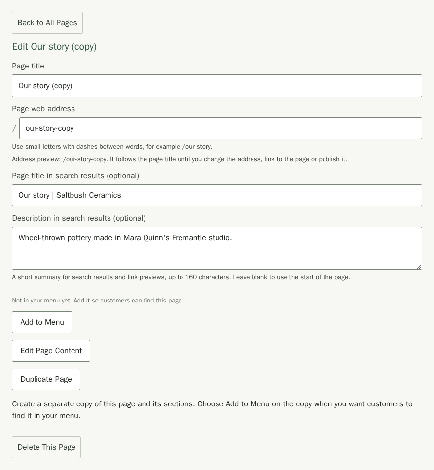
The copy has its own sections. Changing their words, layout or visibility does not change the original, even if a section on the original also appears on another page. Copying Home creates an ordinary page; Home stays your site's home page.
Pictures and selected products still refer to the same files and products. Upcoming Markets and Stockists still show your existing entries. Editing those shared files or records can affect both pages. Links in copied text, buttons and panels keep their original targets, so check them before publishing. No menu link is added for you.
Arrange a Page's Sections
Page Settings is where you edit what is on each page. Choosing Page Settings takes you to the top of the view, and Help with Page Settings opens this part of the guide.
- In Site Pages, choose a page, such as Home, then choose Edit Page Content.
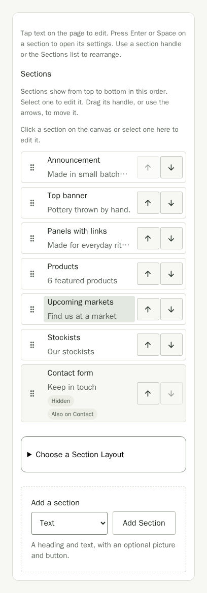
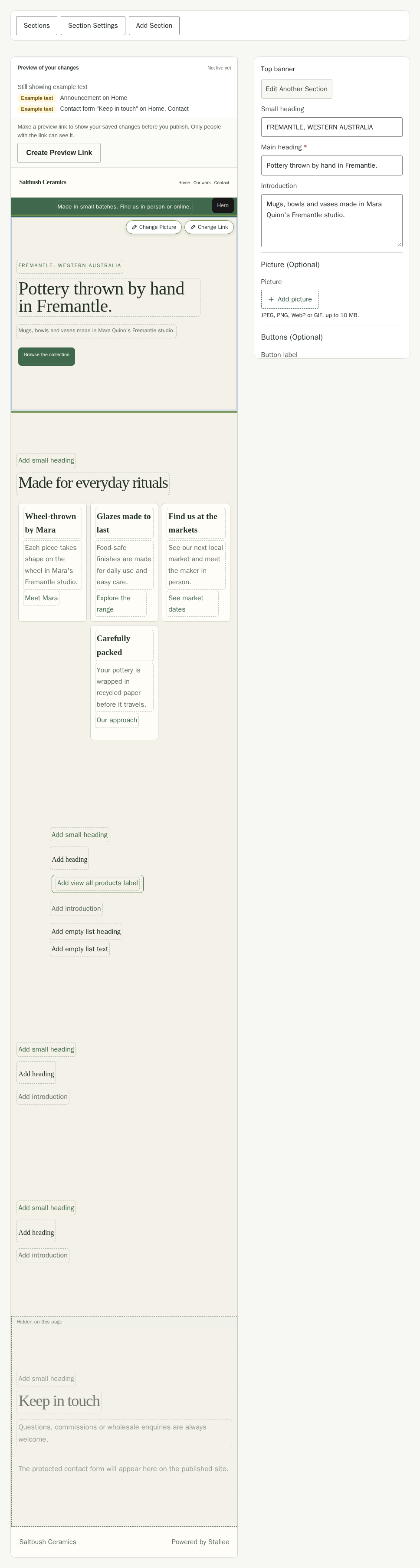
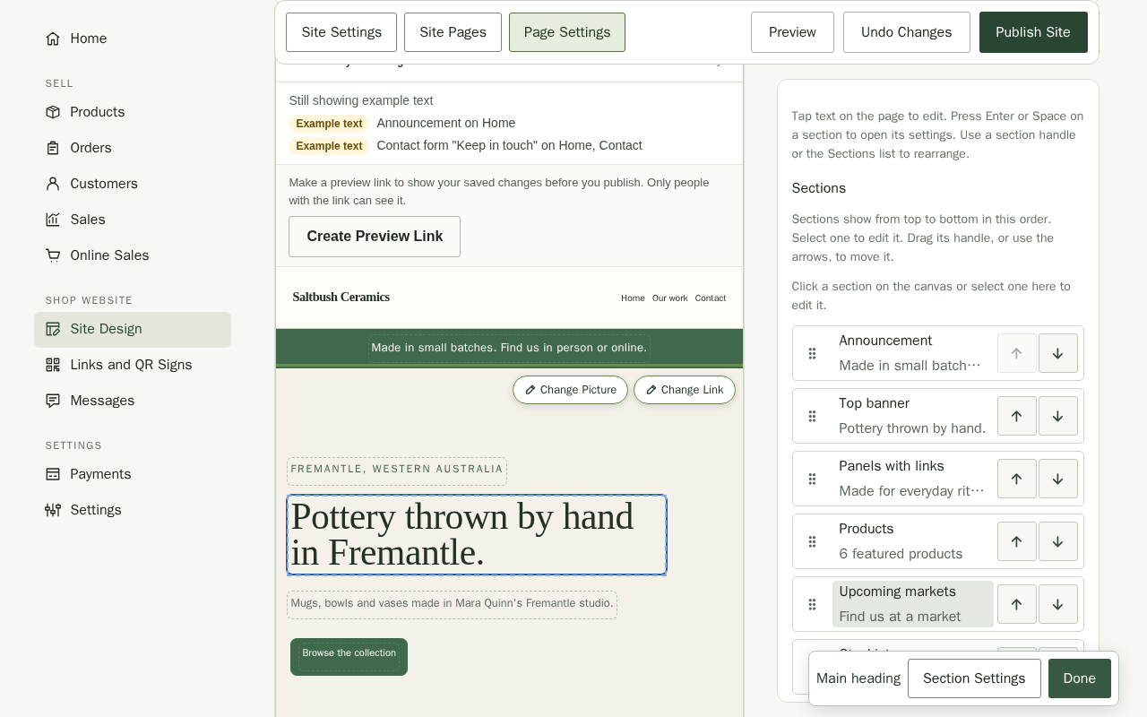
- Page Settings opens with a preview of your page and its sections. Its heading names the open page, such as Page Settings – Home. Use Page beside it to choose another page. Stallee keeps text you just typed in your draft when you switch pages. The Sections list shows the page outline. An entry marked Hidden is on the page but not shown to customers.
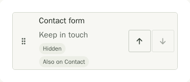
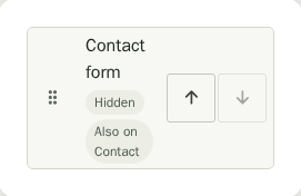
- Each row shows the section type, with a shortened summary on wider screens. Labels below the section name tell you when it is hidden on this page or also appears on another page. Choose the arrows on the right to move a section up or down, or drag its handle on the left. On a phone or tablet, press and hold the handle, then drag. Sections show on your site from top to bottom.
- To add one, choose Add Section above the canvas, pick a section under Add a section and choose Add Section. The note below the menu says what the chosen section does. Pick a new section, or one already on another page to show it here as well. The new section goes straight after the section you have selected, or at the end of the page when none is selected. A note above the canvas confirms where it went, and the canvas scrolls to it. On a phone, the panel closes so you can see it.

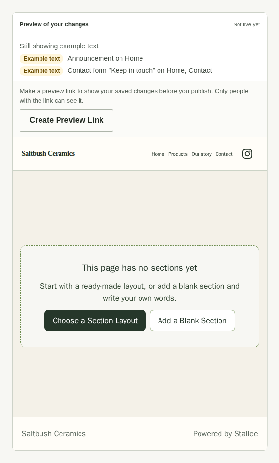
A page with no sections yet shows a card on the canvas. Choose Choose a Section Layout to pick a ready-made layout, or Add a Blank Section to start with a Text section.
Delete a Section
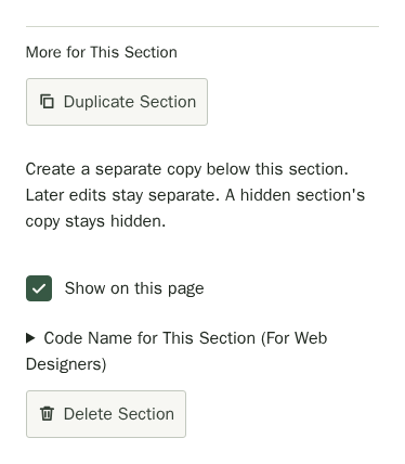
- Select the section, open Section Settings, and under More for This Section choose Delete Section.
- The note Section deleted. appears above the canvas with Undo. Choose Undo to put the section back where it was, with its words intact. The offer lasts until your next change or save.
- A section that other pages also show has Remove from This Page instead. Stallee asks you to confirm, because the section stays on those other pages; choose Keep Section to leave it here.

Preview a Section Layout
- Open Sections. Choose a Section Layout is open above Add a section. Search or choose a category, then choose Preview Layout beside a layout.
- Compare On a Computer and On a Phone. The preview shows only that section in your site's current style. Links, forms and checkout are turned off; picture layouts need your own photos. Product layouts show your published products, or say No products yet until you publish some; no sample products are added.
- Choose Back to Layouts or press Escape to return with your filters unchanged. Choose Add Section to add one independent copy after the selected section, or at the end of this page, instead.
Previewing changes nothing on your page. You can preview at the site's section limit, but Add Section is unavailable with a reason. After adding and editing a section, choose Publish Site when ready. See Site Design for layout preview examples.
Edit a Section
- In Page Settings, choose the words in the preview that you want to change. Type straight into the page. While you type, the Text editing toolbar stays on screen; choose Done when you finish. This also works on a phone. If the same words change somewhere else while you type, a note says your version is kept. Choose Use the Other Version to switch to it, or Keep My Text to carry on. Your latest words are included when Stallee saves or publishes, without waiting.
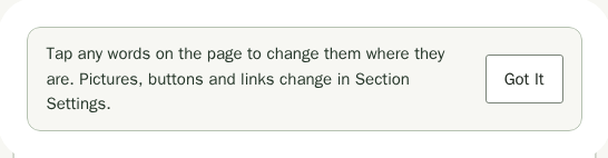
- To change layout, images, links or other section options, choose Section Settings for the selected section. Its words and pictures come first, then Section Appearance, then More for This Section with Duplicate Section, Show on this page, Code Name for This Section (For Web Designers) and Delete Section. A selected section with a picture or a link also shows Change Picture or Change Link on the canvas, which open the same settings. An Image section with no picture yet shows Add Picture instead. The first time you open the canvas, a note explains that you can tap words to edit them; choose Got It to hide it.
- On a phone, Section Settings opens as a panel under half the screen, so the section you tapped stays in view above it. Choose Expand Panel for more room and Back to Canvas to close it. Editable text shows a solid outline with a small pencil.
- Open Section Appearance to change its spacing, width, heading size, alignment or palette background. These choices change only this section. Choose Reset Section Appearance to clear them all at once. A shared section uses the same choices on every page. Help with section appearance opens the Site Design guide at the appearance controls.
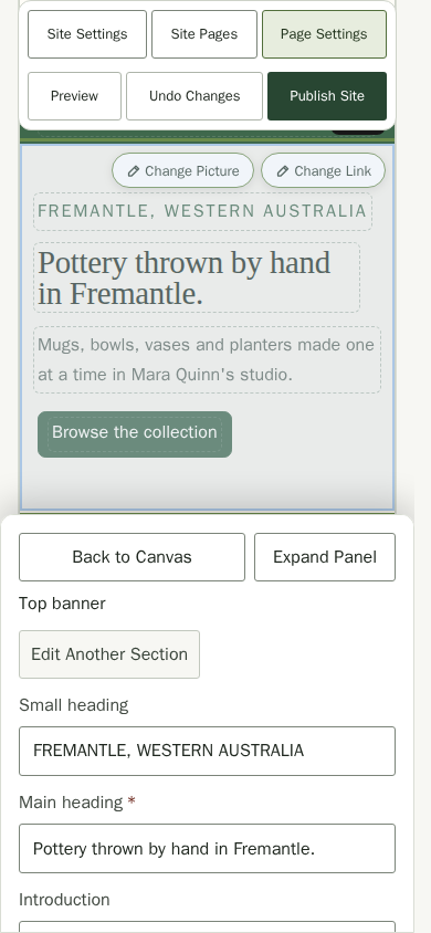
- In section settings, a Top banner has a Small heading, Main heading and Introduction, then a Picture (Optional) group and a Buttons (Optional) group with up to two buttons. A red asterisk marks the boxes a section needs. Choose Add picture to add the picture, say what is in it in Picture description, and choose its Image placement: beside the text, which puts the picture next to the words on a computer screen and under them on a phone, or behind it with Darken the image set so the words stay easy to read.
- Untick Show on this page to hide it here without losing it. A section other pages also show has Remove from This Page, which leaves it on those pages; remove a section from the page when you no longer need it.

The sections you can use:
- Top banner: a big banner at the top of the page with a small heading, a heading, text, an image and buttons. It fills the screen below the menu by default and grows if your words need more room. Choosing section spacing sets its padding and removes that full-screen minimum height.
- Text: a heading and text you format with the toolbar above it: headings, bold and italic words, lists, quotes, links, dividers and pictures. A text section can also have a picture beside the text and a button below it. See Add a picture and a button to text below.
- Panels with links: up to six panels, each with a title, text and an optional link. Give a link its own Link text, or it reads Learn more.
- Contact form: a message form. Messages arrive in Messages, and we email your Contact email to let you know. You can also ask customers what their enquiry is about, add your own questions and let them attach images. See Ask your own questions below.
- Upcoming Markets and Stockists: the markets you list on the Markets page and the stockists you show from the Stockists page, with an optional Introduction under the heading. For markets, choose a Date style: Standard keeps the short date inside each card, and Above the name shows the full date, such as 24 October 2026, above the market's name. Markets also show a Google map of the venue under each card. Untick Show a map for each market to leave the maps out.
- Products: a few featured products with a link to the rest, or your full product list with search, with an optional Introduction. You choose which products show and what each card says. See Choose which products show below.
- Image: one wide image with an optional caption.
- Gallery: up to 12 pictures with descriptions and optional captions. Choose a Photo grid, Paired pictures or Studio strip layout, then add your photos. See Site Design for the steps.
- Announcement: a short strip of news.
- Newsletter signup: an email box that collects people who want to hear from you. They confirm by email, and you export the list from Subscribers.
For Panels with links, expand the panel you want to change. Edit its full-width title and text fields, and add an optional link. The other panels stay folded in the inspector.
Use Questions and answers to answer buying or care questions. In Section Settings, edit each Question and Answer, choose how answers appear, and add or reorder pairs. See Site Design for FAQ layouts and examples. Save your changes, then publish when ready.
For a short call to action instead of the whole form, set a Contact form section's Display to Button only. It shows the heading, the text and a button, labelled Contact Us unless you set the Button Label, that goes to your Contact page. The Contact page always shows the full form, so use a second Contact form section for the short version on Home. Full form is the default, so existing sections do not change.
Choose Columns to set how many panels sit across on a wide screen: Auto, 2, 3 or 4. Auto balances the panels so none is left alone on the last row, so four panels sit two by two. A new section starts on Auto, while a section you made earlier keeps three across until you choose. When the last row has fewer panels than the rows above it, those panels sit in the middle at the same width. Phones always show one column.
Choose Panel links to show each panel's link as Text links, underlined under the text, or as Buttons that look like the other buttons on your site. A panel without a link shows neither.


Most sections with a heading also take a Small heading, a short line shown above the heading, such as Visit us in person.
Add a Picture and a Button to Text
Choose Section Settings for a Textsection to put a picture beside its words, add a button below them, or both. Both are optional, and a text section without them looks exactly as it did before.
- Under Picture (Optional), choose Add picture and pick a JPEG, PNG, WebP or GIF file of up to 10 MB. The control says Uploading… while the file is on its way, and if the file is too large or not a picture it says so beside the control and leaves the rest of the form as it was. The picture appears beside the text on tablets and computers, and below the text on phones.
- Say what is in the picture in Picture description, for example A celadon bowl on a wooden bench. People who use a screen reader hear it, and it shows if the picture cannot load. A picture without a description is flagged until you write one.
- Choose Picture side: Right (the default) or Left. Choose Replace picture to use another file or Remove picture to take the picture away again.
- Under Button (Optional), type a Button label, such as Visit the studio. Under Button link, answer Where should this button take people?: choose A page on this site and the page, such as Contact; A section on this page and the section by its name; or Another website and its address starting with https://. To take the button away, choose No link and clear the label.
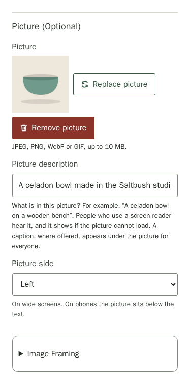
To crop a Top banner, Text or Image section's picture, open Image Framing, which sits under the picture and opens by itself when you add one. It shows your picture framed as the page will frame it. Choose its shape, whether to fill the frame or show the whole image, and which part stays in view. Original proportions keeps the picture's own shape. A banner picture behind the text uses focus only. Use Default Framing restores the original layout without changing your uploaded file. See Site Design for the controls and examples. Save your changes, then publish when ready.
Ask Your Own Questions
Choose Section Settings for a Contact form to shape what customers fill in. Every question you add is optional for them.
- Under Enquiry Types, choose Add Enquiry Types and name two to six types, such as Custom order and General. Customers pick one first.
- Under Extra Questions, choose Add Question and type the question, such as Preferred colours. Tick Several lines for a longer answer, or choose an Answer type: Text, Email address or Phone number. A phone or email question gives customers the right keyboard on a phone and lets their browser fill it in, but it does not check what they type. Use Show for to ask it only for one enquiry type.
- Under Images, tick Let visitors attach images, name the field and choose up to three images. Customers can attach JPEG, PNG or WebP files of up to 5 MB each.
- Under Message Box, rename the message, for example to Other notes, or untick Visitors must write a message to make it optional.
- Each group folds away when you choose its name, so a finished form stays short. A red asterisk marks the boxes the form needs, such as Contact email; until you replace the example address with your own, the box says so.
The customer gets an email receipt with a copy of their message and answers. Your notification includes their contact details and a link to the enquiry. Both emails show how many images were attached. Open Messages to view the images.

Answers arrive in Messages as one message that lists the enquiry type and each answer, with any images underneath.
Choose Which Products Show
Choose Section Settings for a Productssection to decide what it shows. Only published products ever appear.
- Under Products to show, choose All products, One collection or Choose products. A collection is one you have already added products to in Products.
- For Choose products, type in Search Products and choose Add next to each one, up to 24. Use Move Up and Move Down to set the order customers see, and Remove to take one out. Until you choose at least one product, the section stays hidden.
- Under On Each Product Card, tick Show a short description or Show the category, or untick Show stock on cards to hide the number available.
- For the full product list, choose how many products customers see on each page in Products per page: 20, 40 or All (up to 200). For a few featured products, change Button label if you would rather the link to your Products page did not read View all products.
- Under When There Are No Products to Show (Optional), write a Message title and Message text for times the list is empty, such as while your stock is at a market stall. Leave them empty and the full product list says No products yet, and a featured list stays hidden.
On phones, the link to all products sits below the featured section's heading. Customers can open it to browse your full range.
The full Products page lets customers search and filter by category, subcategory and collection. Choose Search to apply a search, and Sort By puts the list in the order they prefer. If nothing matches a search, Clear Search shows the range again; if filters match nothing, Clear Filters does.

Add a Page
- In Site Pages, choose Add Page, then Blank page at the end of the choices.
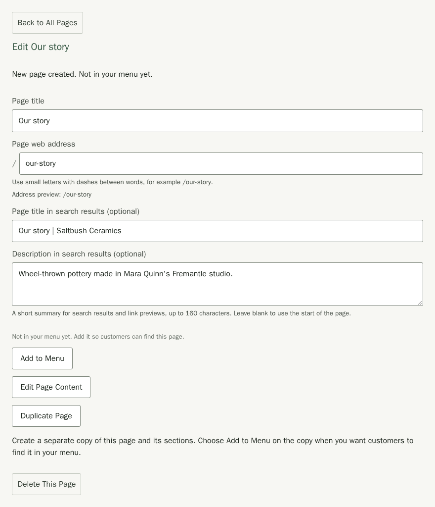
- Leave Add to Menu unticked until you have named the page, and choose Create Page. The page opens with the message New page created. Not in your menu yet.
- Enter a Page title, such as Our story. The Page web address follows the title, so it becomes
/our-story, and Address preview shows where customers will find the page. It stops following the title once you type your own address, link to the page or publish it. - Optionally set Page title in search results (optional)and Description in search results (optional). Search results and link previews can show the description.
- Wait for Changes saved. The new page appears in the list.
- In Site Pages, choose Edit Page Content to open Page Settings.
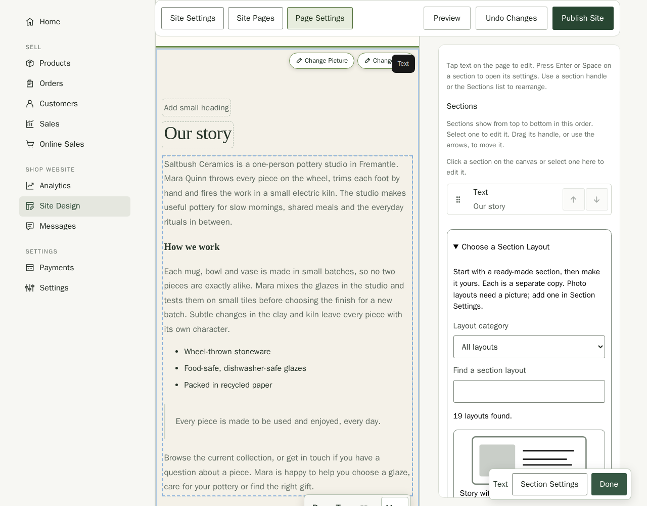
- In Page Settings, choose the Text section's words on the canvas and type straight into them. The formatted text editor opens with its compact toolbar. Choose More for headings, lists and pictures. Choose Done when you finish. The text keeps your site's fonts and spacing, and longer content grows with the page. Tap its heading or button label to edit those words too. For pictures and link destinations, choose Section Settings. On desktop, editable text uses the normal text cursor. On a phone, tap the words to edit them.
- Select words and choose Bold or Italic. To turn a line into a heading or a quote, put your cursor in it and choose Large heading, Heading, Small heading or Quote in the text style list. Choose Normal text to change it back.
- Choose Bulleted list or Numbered list to start a list, and Add a divider to draw a line between parts of the text. Undo and Redo take back or repeat a change.
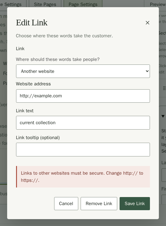
- To add a link, select the words and choose Add a link. Under Where should these words take people?, choose A page on this site and the page, A section on this page and the section, or Another website and type its address in Website address, starting with https:// (or mailto: for an email link). Then choose Save Link. If a website address cannot be used on your site, such as one starting with http:// or a name like example.com with nothing before it, the box explains what to change before it saves.
- To add a photo, put your cursor where it should go and choose Add a Picture. Choose the Picture file, describe it in Picture Description, and choose Add Picture. People who use a screen reader hear the description, and it shows if the picture cannot load.
- If you would rather type the formatting yourself, choose Section Settings, then Edit with Formatting Codes. For example, ** around words makes them bold and a line starting with > is a quote. Choose Edit with Formatting Codes again to go back to the visual editor.
- Add any other sections from the Sections outline.
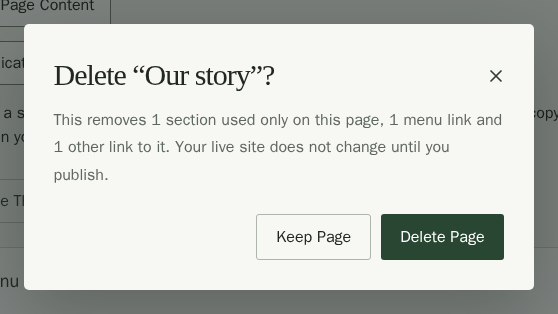
To remove a page, choose Back to All Pages, open the page, then choose Delete This Page. Stallee asks you to confirm and says how many sections used only on that page, how many menu links and how many other links to it go with it. Buttons, panels and the announcement stop linking to the deleted page, and a top banner's main button goes to Home instead. Choose Delete Page to remove it, or Keep Page to leave it as it is. Sections that other pages also show stay on those pages. Home is the only page you cannot delete, and nothing changes on your live site until you publish.
Add Pages to Your Menu
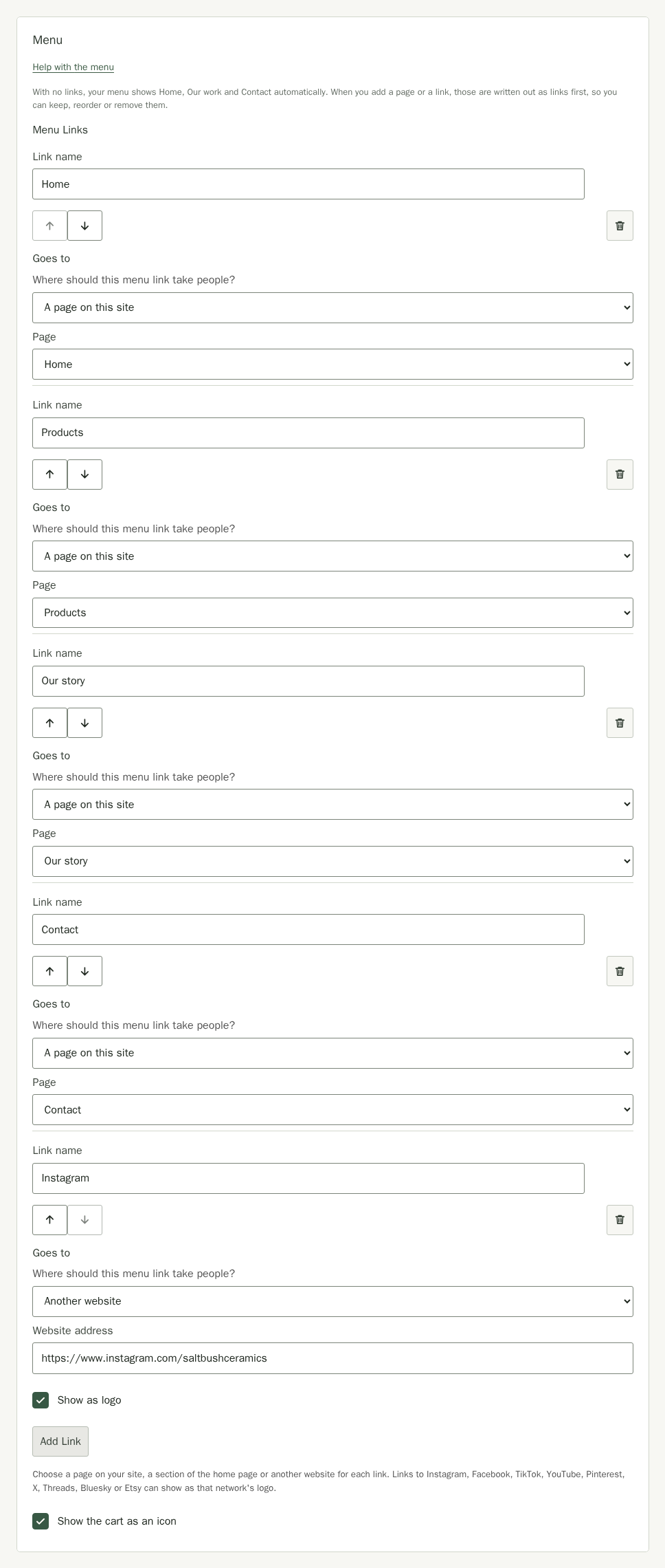
Help with the menu, beside Menu in Site Pages, opens this part of the guide. A page you create with Add to Menu ticked is already in your menu. Until you add a link of your own, your menu shows Home, Our work (the first Panels with links on Home) and Contact automatically. The first time you add a page or a link, Stallee writes those out as links first and says so, so your menu keeps them and you can reorder or remove them.
- To add a page later, open it in Site Pages. Its details say Not in your menu yet. Choose Add to Menu; its title becomes the link name.
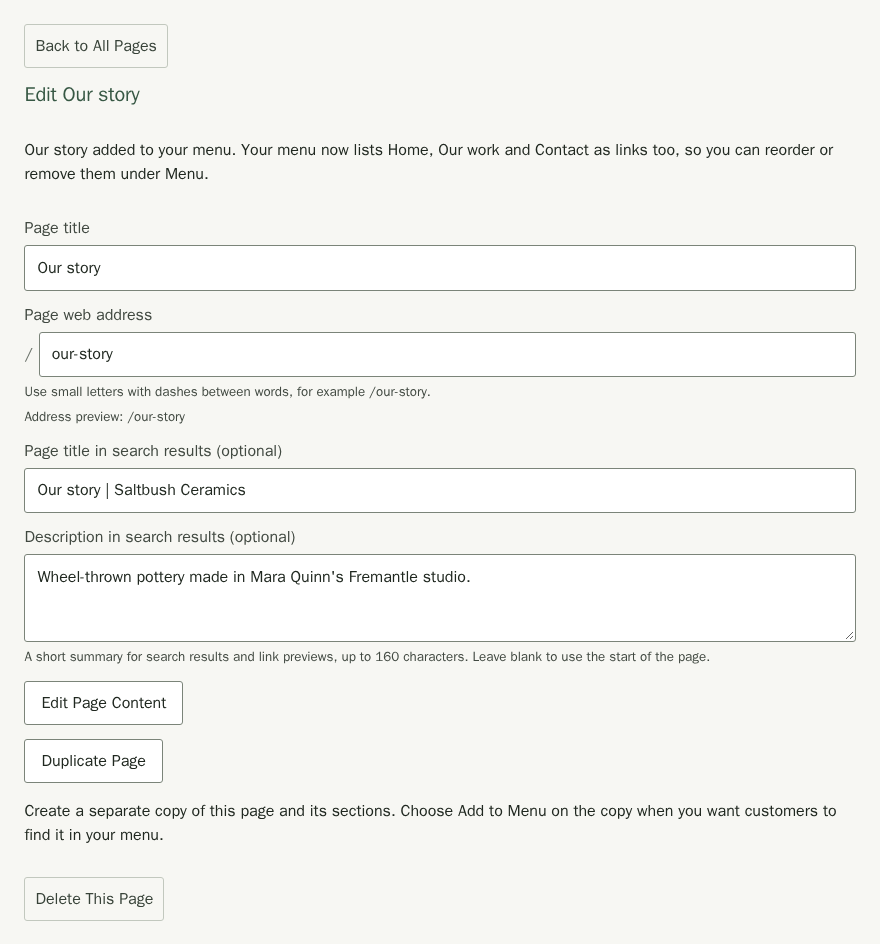
To change the menu, choose Back to All Pages and use Menu Links.
- To add another link, choose Add Link under Menu Links.
- Type a Link name, which is the word customers see. Under Where should this menu link take people?, choose A page on this site and the page, A section on the home page and the section, or Another website and its address starting with https://. For Saltbush, Mara renames Our work to Products and points it at the Products page, then adds Instagram as another website.
- Repeat for each page you want in the menu. Use Move Up or Move Down to change its position. The accessible control names include the link number, such as Move menu link 2 up and Move menu link 2 down. Choose Remove Link to take it out.
If you change a page's Page web address, its menu links, and any buttons, panel links and announcement link that lead to it, move to the new address once the address can be used. While you're still typing, or if the address can't be used, they stay at the page's saved address. Links to your other pages stay where they are, even if the address you type passes through one of theirs on the way. A web address uses small letters, numbers and single dashes, such as /our-story. If the address can't be used, the field says so. Fix it before you save. Add to Menu shows on a page's details only while your menu has no link to it.
On phones, menu links are available from the site menu.
Keep Your Markets and Stockists
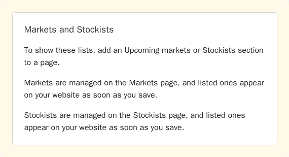
Markets and stockists are not part of your site's pages: you keep them on their own pages, and the ones you list show wherever a page has an Upcoming Markets or a Stockists section. They show on your site as soon as you save them, without publishing.
- To list a market or event of your own, use the Markets page link under Markets and Stockists in Site Settings. Add it under Our Own Markets and turn on Show on website. See Markets.
- To list a shop that sells your work, use the Stockists page link and turn on Show on website for it.
If your market is in the Stallee market directory, link it in Markets instead. Its dates then stay up to date by themselves.
Save and Publish
- Wait for Changes saved. Your live site does not change.
- Use Page beside the Page Settings heading to check each page.
- Choose Publish Site when you are ready to make your saved changes live. See Site Settings for more on publishing.